 Jon BondProduct & accessibility designer
Venturebeam
Fintech / Venture investing · 2024
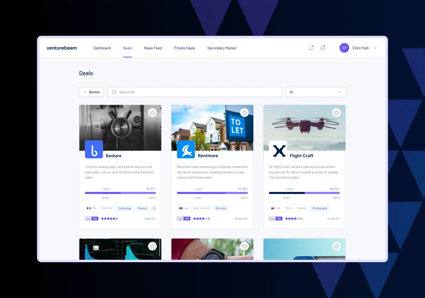
Venture investing is fragmented, siloed and slow. The brief was a first release worth an investor’s time.
Venturebeam connects global high-impact entrepreneurs with smart capital: the best access, analysis and swift deal completion. The experience it set out to improve remains highly fragmented, siloed, often painstakingly antiquated, inaccessible and inefficient.
The platform’s ambition ran from primary funding rounds to a secondary market, with private deal syndications, impact scoring, data rooms and performance metrics, and a private impact investor community. My job was to get it from that ambition to a first release worth an investor’s time: a minimum valuable experience, not just a viable one.
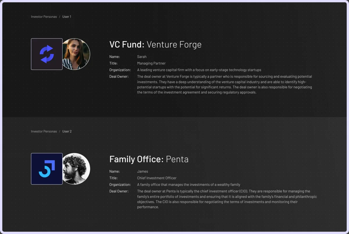
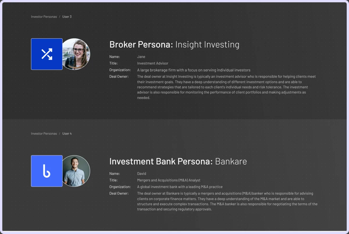
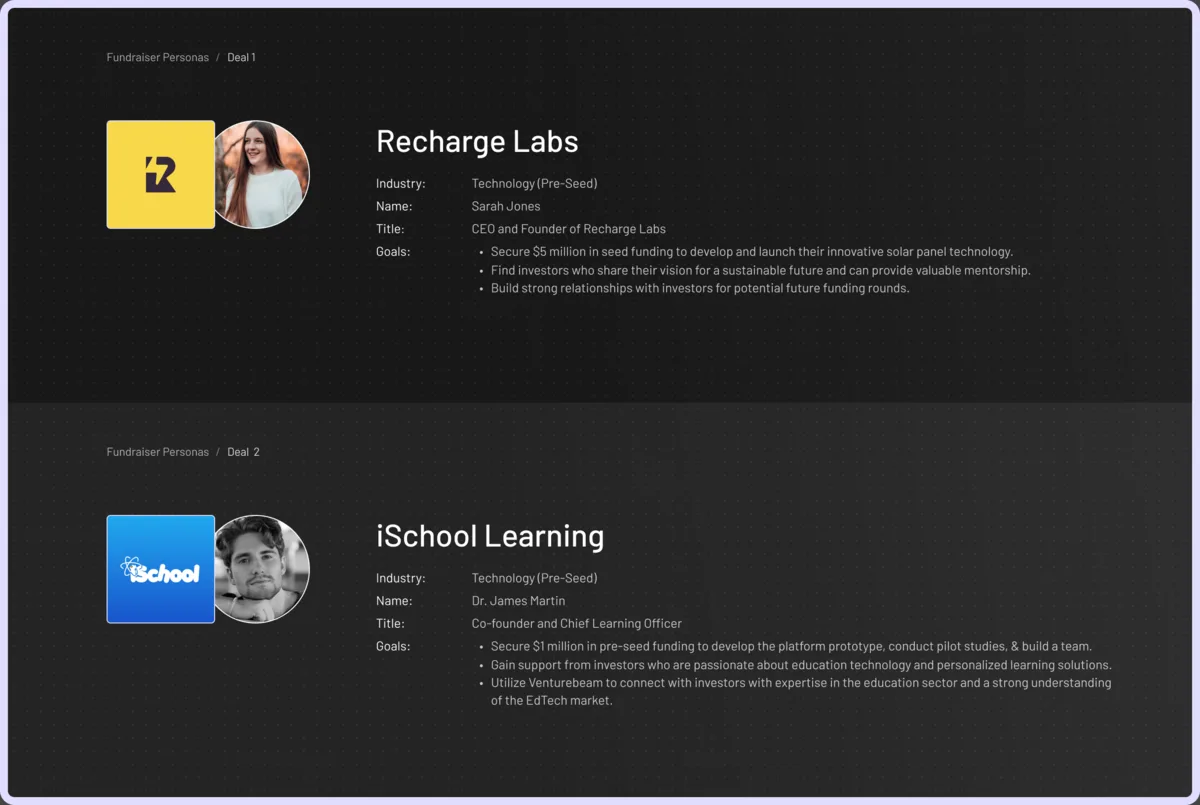
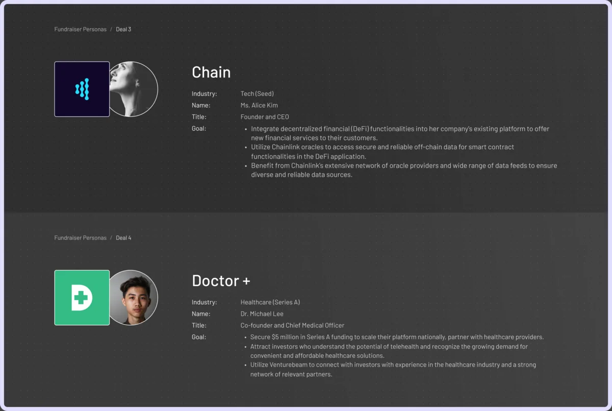
Before the business case, the people. Eight personas, four on each side of a deal. Investors: a VC partner, a family office CIO, a broker and an M&A analyst, each with what they own in a deal. Fundraisers: four founders at pre-seed to Series A, each with a raise target and what they need from an investor beyond money. Penta and Recharge Labs, who reappear in the workflow below, come from here. Each persona is drawn from a real Venturebeam client; the names, companies and faces are changed to keep those relationships private.
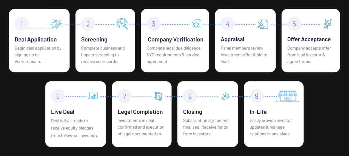
With the people named, three diagrams got us to the business case, each narrowing the last. The value chain first: the whole journey a deal takes through the platform, from application to in-life, in nine steps. It is the high-level map everyone could agree on before arguing about what to build, and it names every place the product has to do a job.
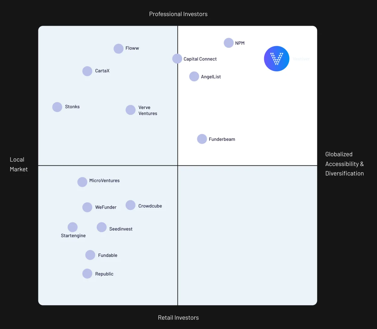
A map of the journey does not say where to compete. So the second diagram places the rivals on two axes, professional against retail investors and local against global. The retail platforms crowd one corner; the Venturebeam platform belongs top right with the professional, global names. That corner is the position to defend, and it turns the nine steps into a question: which of them does a professional investor need before anything else?
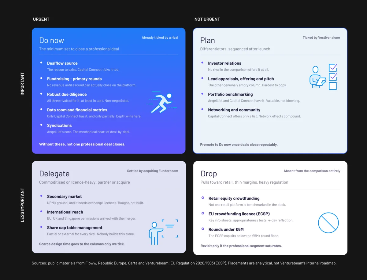
An Eisenhower matrix answers that question. I used it because it forces two separate judgements on every feature, is it urgent and is it important, instead of one vague ranking, and because the four squares each come with a verb: do now, plan, delegate, drop. Only what is needed to close a professional deal makes the Do now square. The differentiators no rival offers are planned for after launch. The secondary market is delegated to the merger with Funderbeam, which brought the licences. Retail equity crowdfunding is dropped. Placements are my analysis from public materials, not Venturebeam’s internal roadmap.
The call that fell out of the Do now square: focus not on retail deal flow but on professional private deal syndications, as a new platform feature. That is the workflow below. The audience work that led there, the A.C.T. framework, comes back at the end, where it shaped the public site.
Managing a private deal, as the deal owner.
Penta, a sponsor company, has agreed terms with Recharge, the fundraising company, and now owns the private deal. The offers manager is where the raise happens: invite investors, watch acceptances, and take offers against the minimum and maximum targets before the deadline.
Each step below is a screen from the Figma prototype. The companies and figures are sample data.
- Start from an honest zero
The deal is live and nothing has been raised yet. The overview shows only the owner’s own commitment against the minimum and maximum targets, the deadline, and an empty progress ladder, so the next action is obvious: invite.
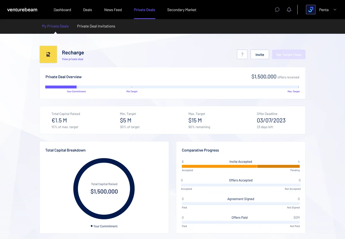
Step 1 · Private deal, first open - Show the owner around once
A six-step on-screen tour points at the help button, the invite action, the raise progress and the investor list. It runs the first time only and can be reopened from the help button, so the manager never needs a manual.
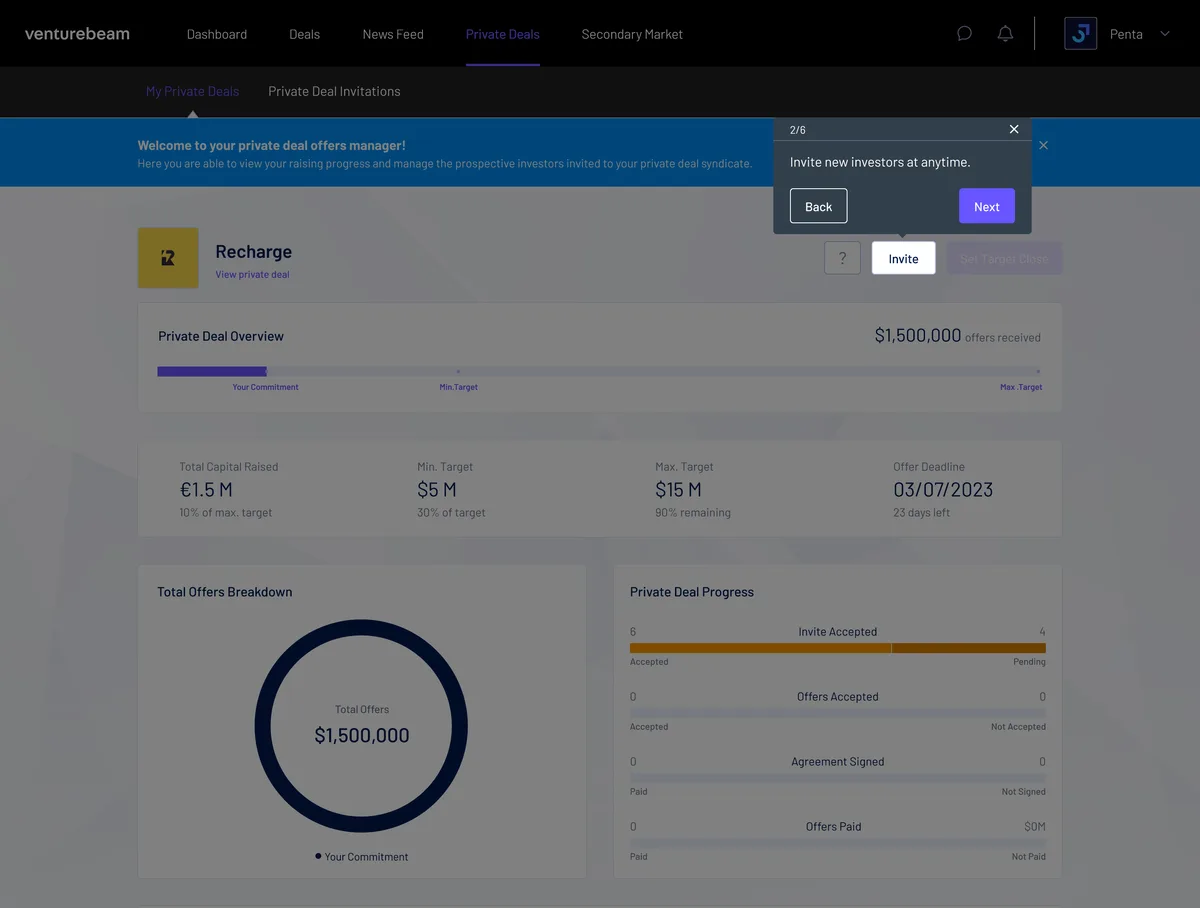
Step 2 · On-screen tour, 2 of 6 - Invite investors and watch them respond
Invitations go out to named investors and companies. Each row carries its own status bar: pending acceptance, invite accepted, or not interested, with the offer amount once one is made. The owner sees who is in, who is thinking, and who has passed.
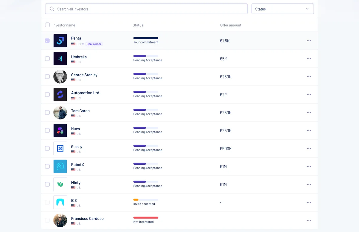
Step 3 · Investor invitations - Read the raise at a glance
As offers land, the same overview fills in. The bar shows offers received against both targets, the cards restate it as percentages and days left, the ring splits commitment from offers made and accepted, and the ladder tracks invites, offers, agreements and payments in the order they happen.
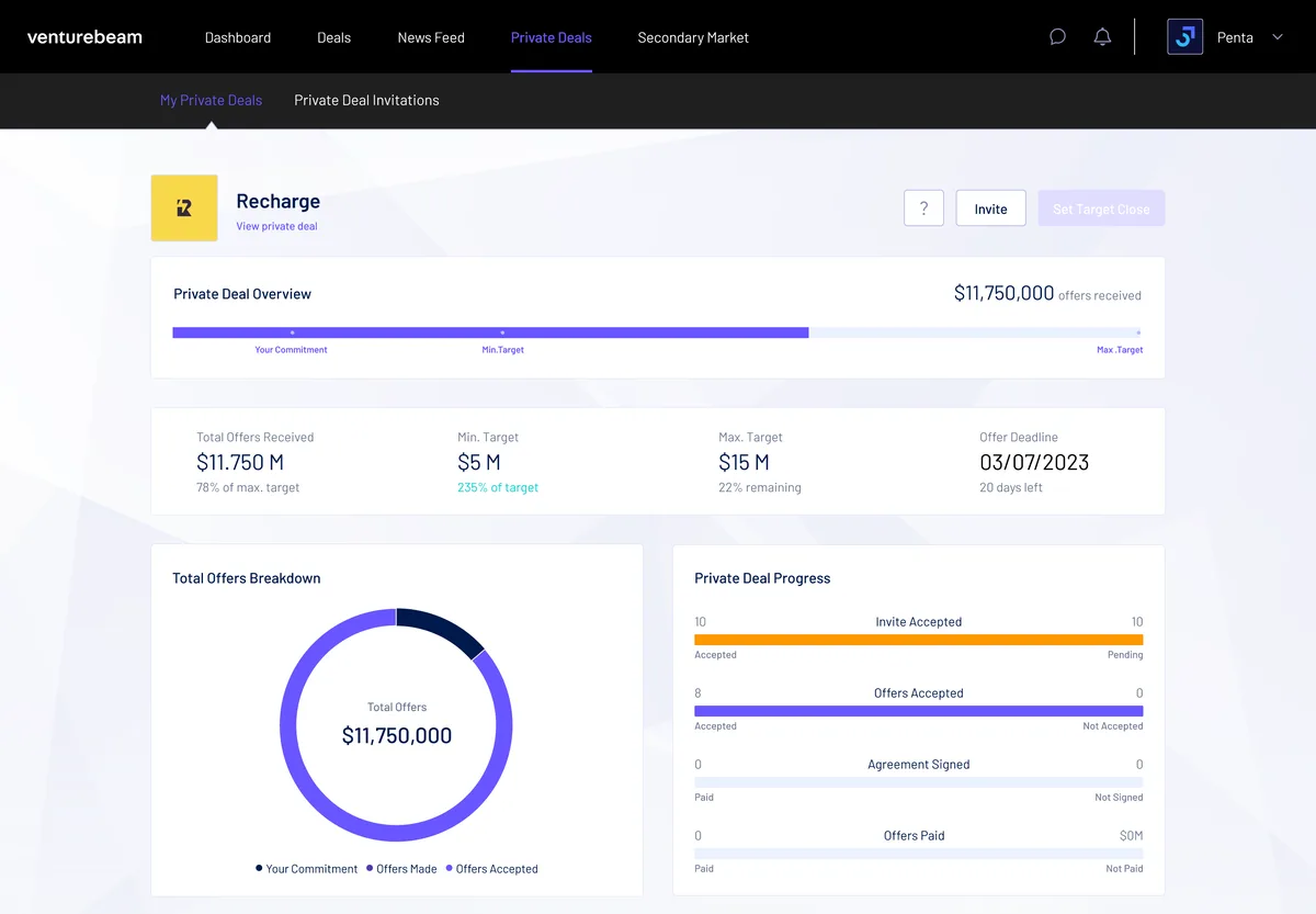
Step 4 · Offers received - Select and accept offers
The owner ticks the offers to take. A running total sits beside the selection, a note says how far the selection is from the maximum target, and one button accepts them together. Rows that have not offered stay unticked and visibly different.
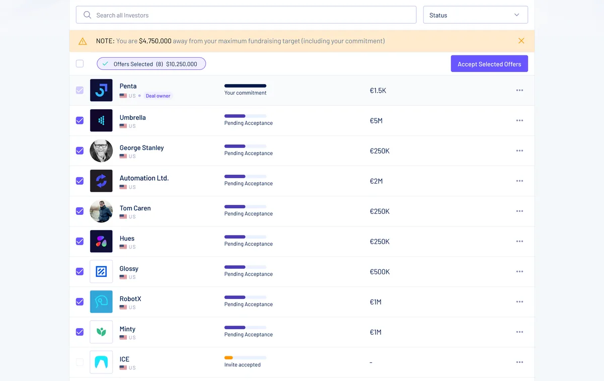
Step 5 · Accept selected offers
Opens in a new tab. Use the arrow keys to step through the frames.
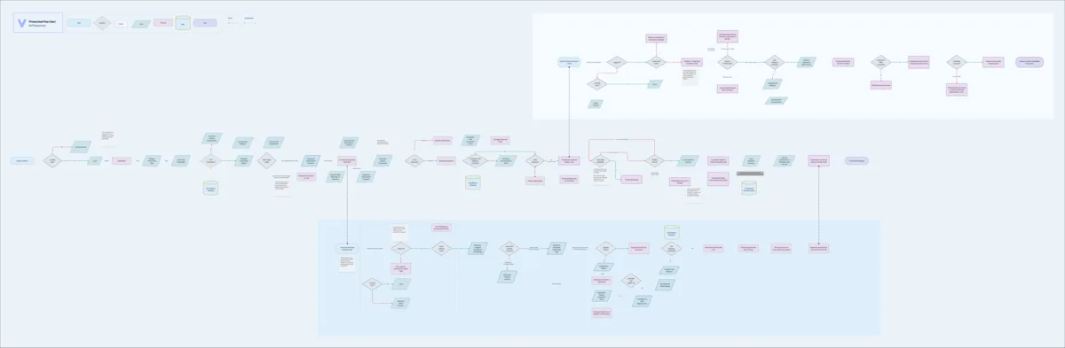
This is one branch of a larger flow: creating the private deal, agreeing terms with the fundraiser, and what each invited investor sees on their side. The dashboard is the part an owner lives in. The whole chart follows, zoomed out: the owner’s row runs across the middle, the invited investor sits above it and the fundraiser below.
Tokens in three layers, so the system can grow.
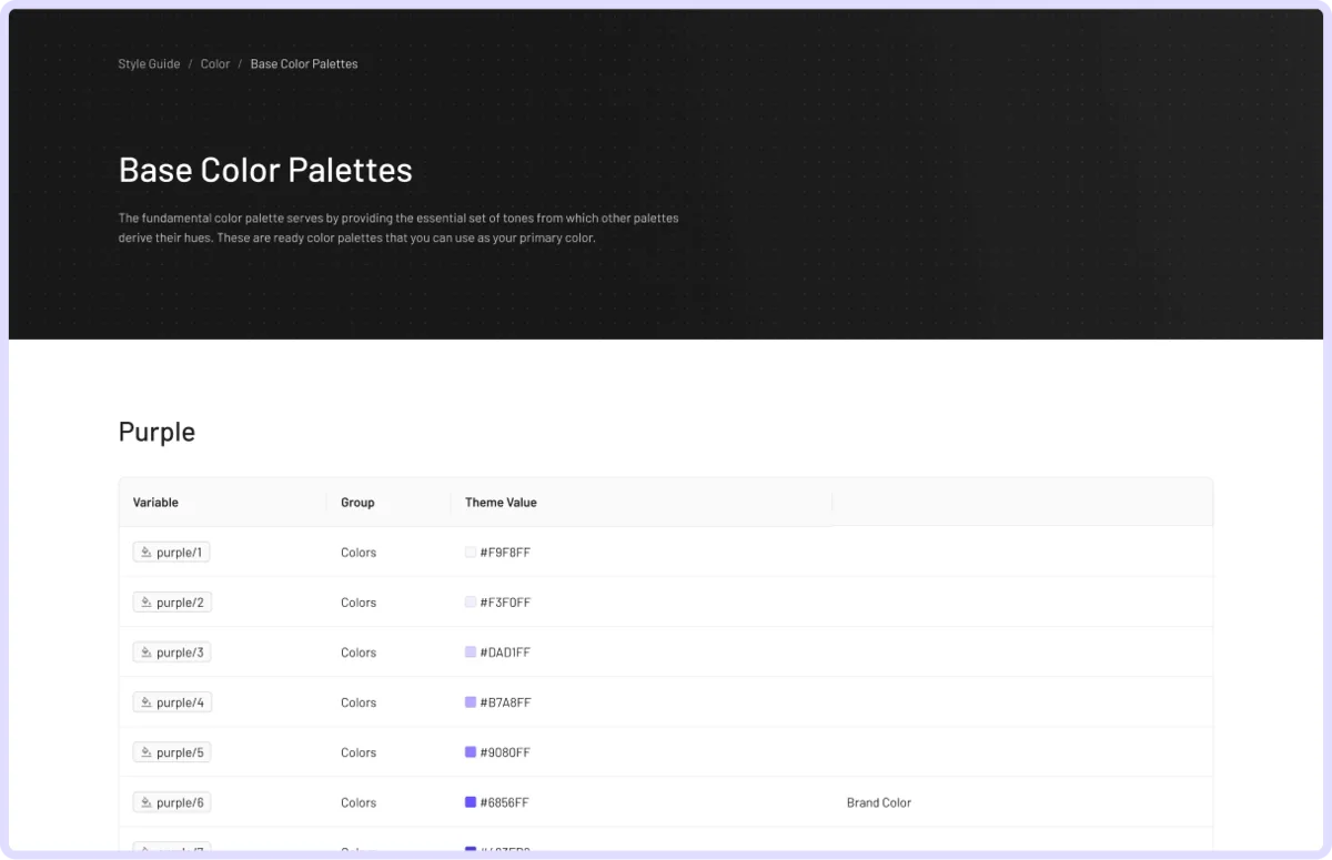
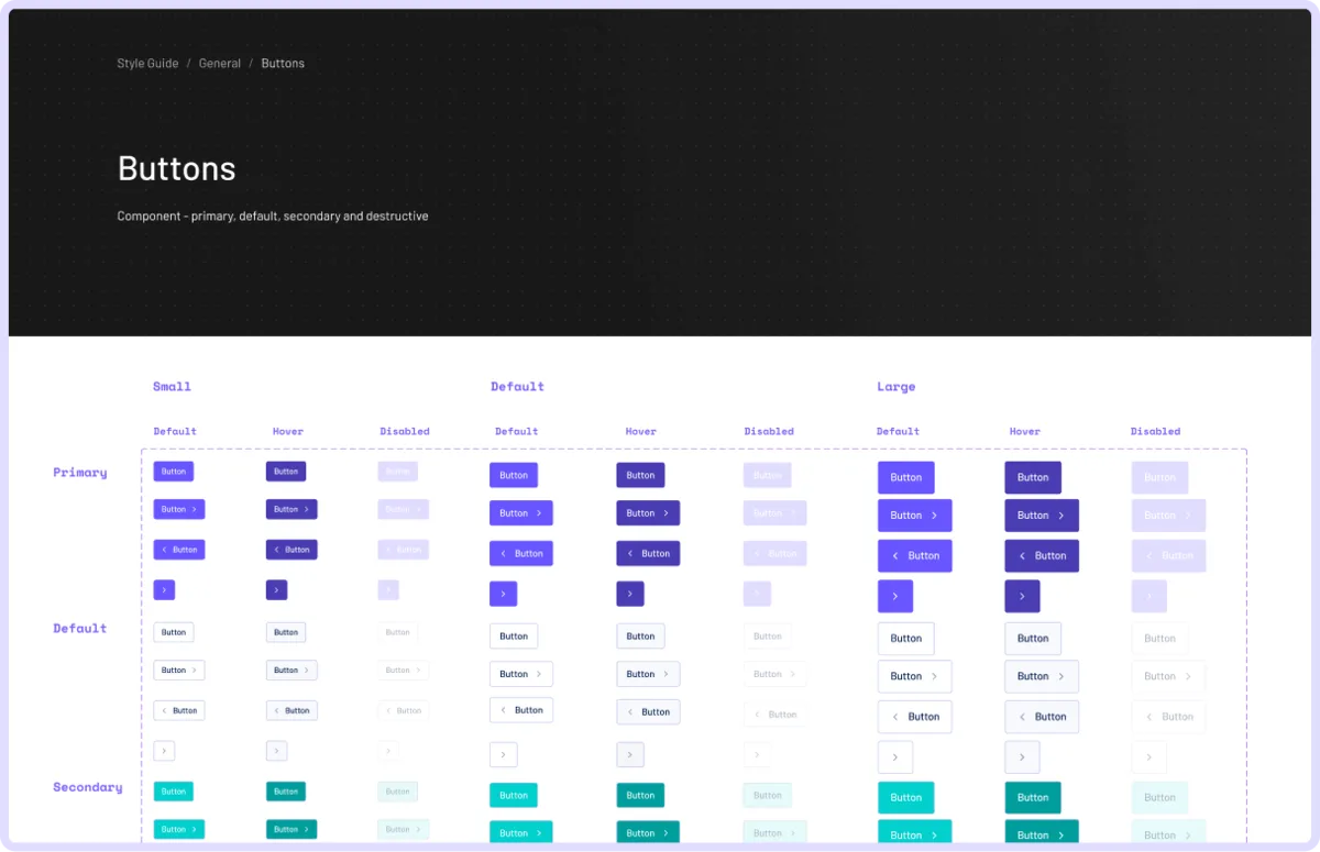
Design tokens in this system come in three layers: primitive tokens (the raw palette, type and spacing), semantic tokens (what a value is for) and component tokens (what a button or input actually uses). They are not simple groupings but a chain: semantic tokens point at primitives, component tokens point at semantics. A change at the top moves everything; a change at the bottom moves one thing.
Built as Figma variables, the layers let designers and developers make global or component-specific changes without a hunt, and keep a growing product consistent.
A.C.T.: the frame behind the product, made public on the site.
It’s all about knowing your audience, what language and messages resonate with them, and the tactics, triggers and touchpoints that move them to action. The A.C.T. framework boils that down to three questions, answered before any screen was drawn. The marketing site is where all three answers are on show.
- Audience
Professional investors, entrepreneurs and impact-driven companies. They want access to high-potential start-ups and scale-ups, streamlined deal-making, and one place to raise funds, manage investments and track progress. The site gives each of them their own route: Investors, Entrepreneurs.
- Communication
Professional, impact-driven language: invest in companies making a significant difference for people and planet, and be part of a community that shares those values. One line carries it from the first viewport: create impact in venture investing.
- Touchpoints
Partnerships with venture capital firms, family offices and angels; LinkedIn, Twitter, email and targeted advertising; and one user-friendly platform behind all of them. The site is the touchpoint every other one lands on.
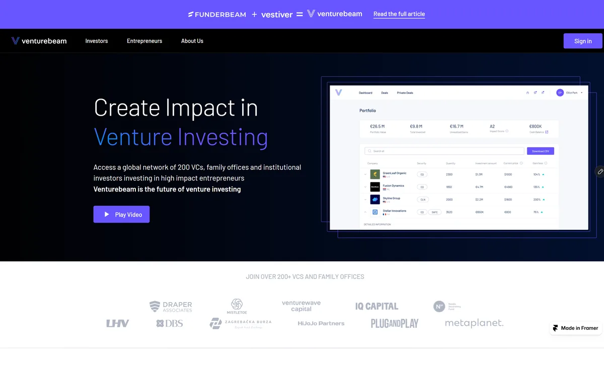
The home page states the proposition and shows the product. Investors and Entrepreneurs each get a page that speaks in their terms, with the same beam shapes, the same purple, and the same dashboard mocks doing the proving.
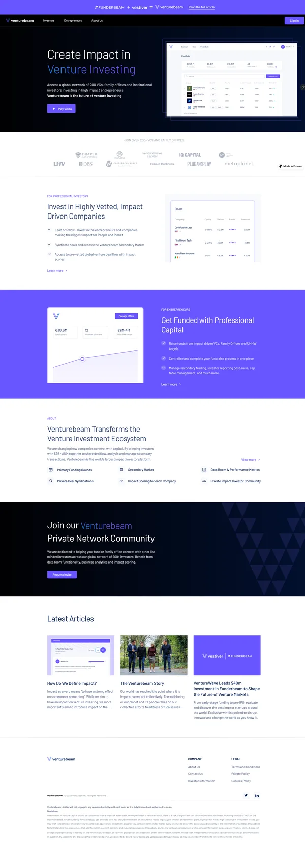
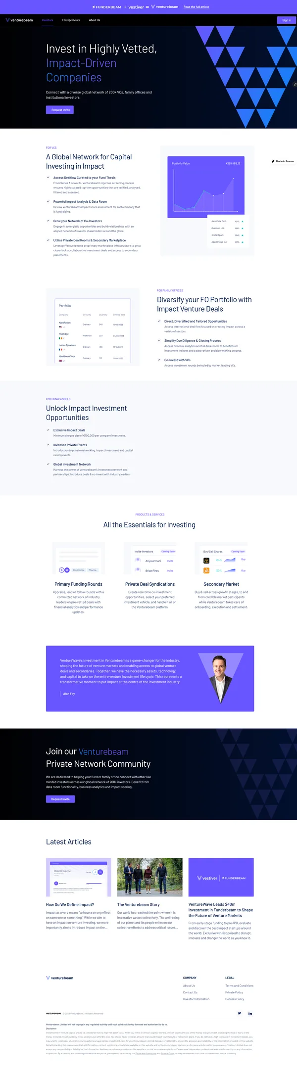
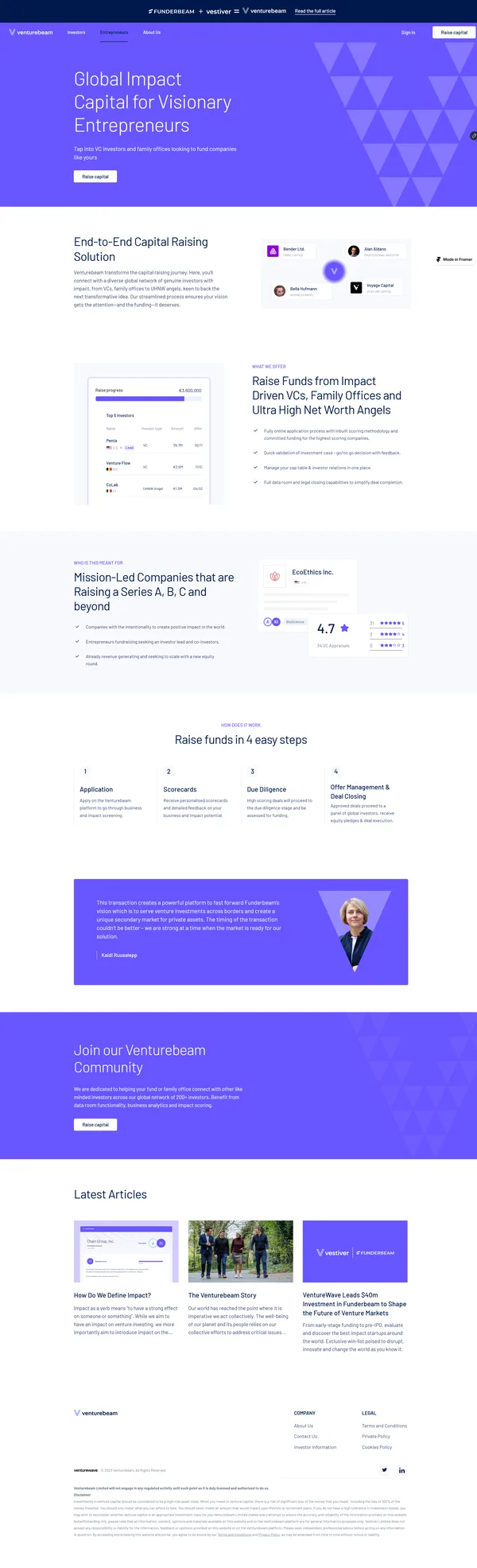
The same three pages at phone width, each as one tall sheet. Sections stack in the same order, the beam shapes and dashboard mocks shrink rather than disappear, and the calls to action stay full width.



What shipped, and what is not yet known.
The private deal syndication workflow, the token system and the public site all shipped. The A.C.T. framework gave us the audience, how they communicate and where to reach them; the value proposition and the minimum valuable experience followed from it.
The product is live, but I don’t have usage or outcome figures for it, so none are reported here. Venturebeam has since merged with a company whose licences will let it scale and enter the secondary market, the touchpoint the platform was designed to grow into.