 Jon BondProduct & accessibility designer
Airlines have big budgets and unpleasant booking flows. FlyUX wanted the opposite.
FlyUX is a fictional start-up airline. Its booking experience had to be fast, intuitive and easy enough to count as a competitive advantage. The project ran the full UX process, from research to a working prototype, with the front half deliberately weighted: understand the problem before drawing a screen.
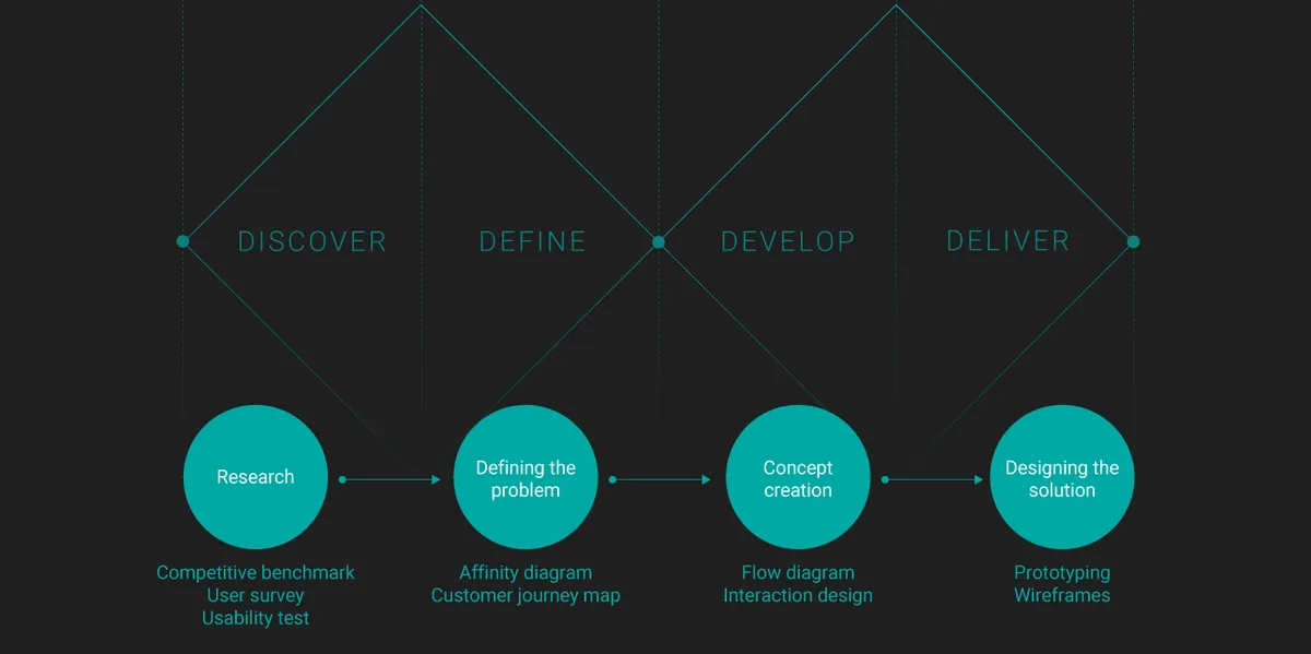
Three methods, so the problem was measured rather than assumed.
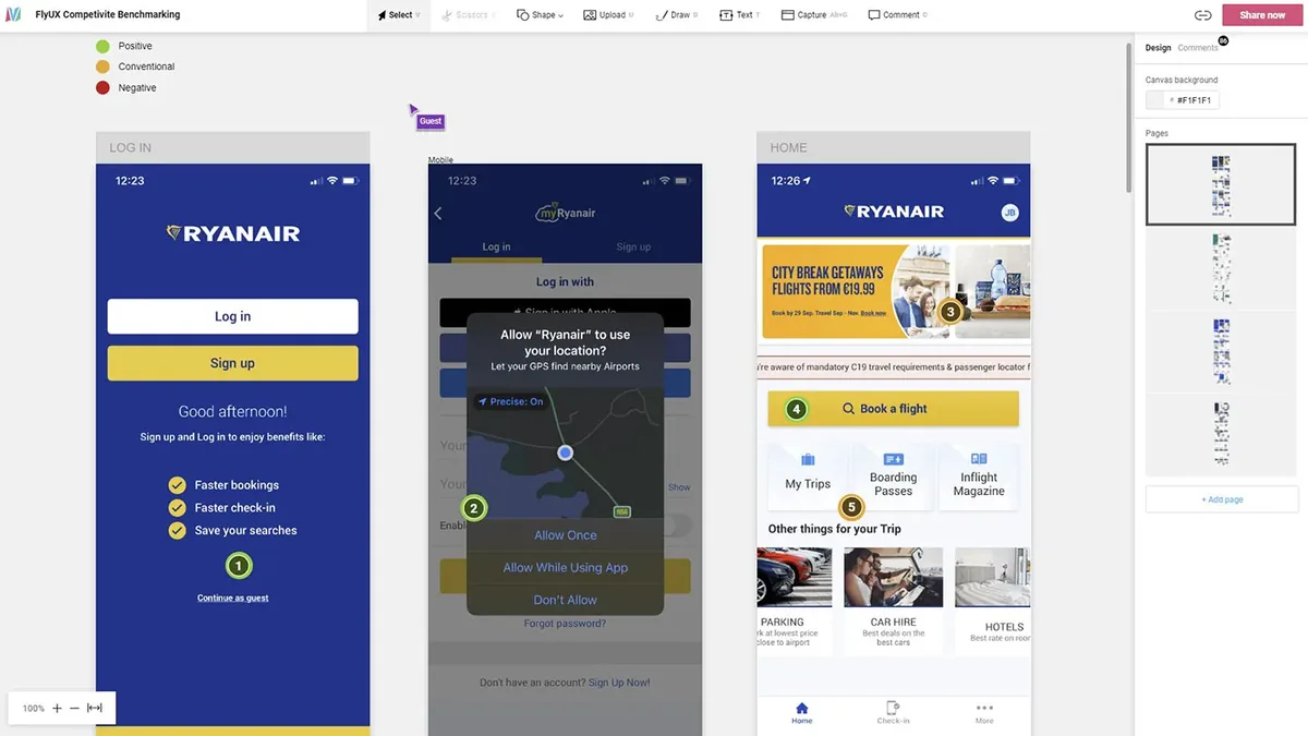
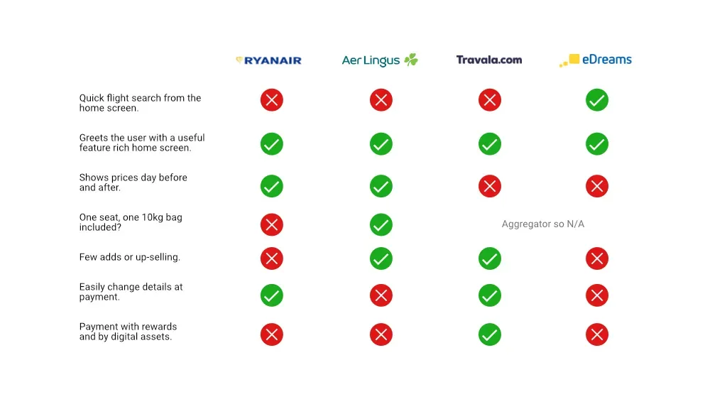
Competitive benchmark. Two airlines, Ryanair and Aer Lingus, and two aggregators, Travala and eDreams, walked screen by screen against design heuristics, with good and poor practice marked. Labelled flights (cheapest, fastest) speed up decisions. Prefilling from location saves time. It is often unclear whether a price is per person or in total.
User survey. Five questions on SurveyMonkey. Most respondents said they visit an airline's app several times before booking, and price is by far the biggest factor.
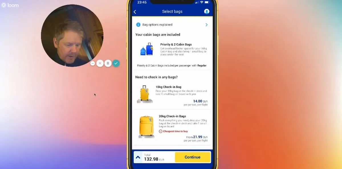
Usability tests. Six participants, one session each. After a short interview about past airline apps, each completed two tasks on existing apps while I recorded the phone through Reflector and their reactions through Loom. The recordings showed exactly where the booking flow stalls and where frustration starts.
Notes from each recording were colour-coded for pain points, positives and neutral observations, covering goals, behaviours, mental models and context. Read the note-taking PDF (3.5 MB).
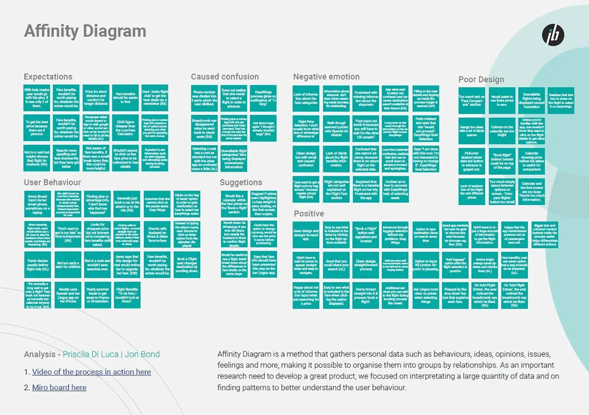
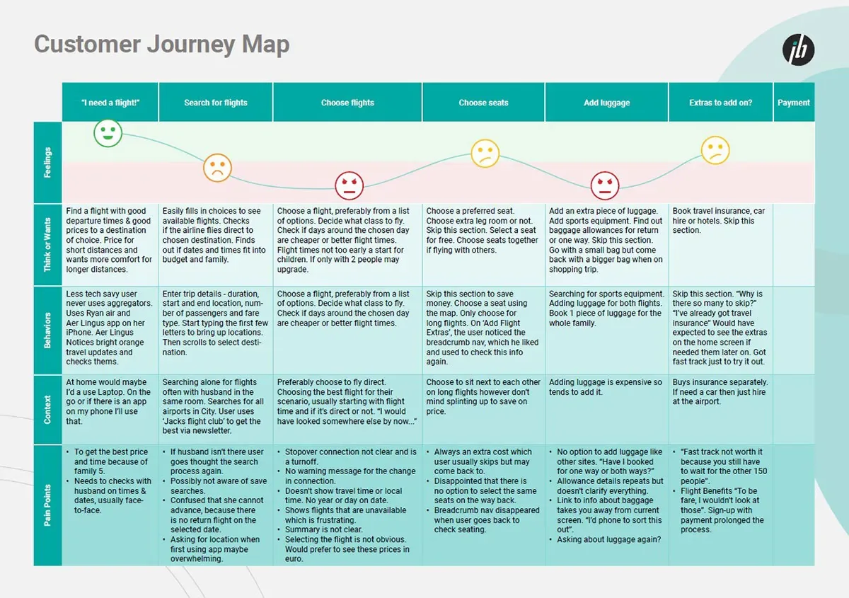
Turning notes into a map: an affinity diagram and a customer journey.
Research is only useful once it is organised. Every finding went on a post-it and was grouped by category with Priscila Di Luca: expectations, user behaviour, what caused confusion, negative emotion, positives, poor design and suggestions. That made it clear which hurdle sits at each step of booking.
The customer journey map then lays the steps out, from wanting a flight through search, choosing flights and seats, luggage, extras and payment, with what people think, do and feel at each one and the pain points beneath. It became the starting point for the flow and the easiest way to explain the research to anyone else. Read the diagrams PDF (176 KB).
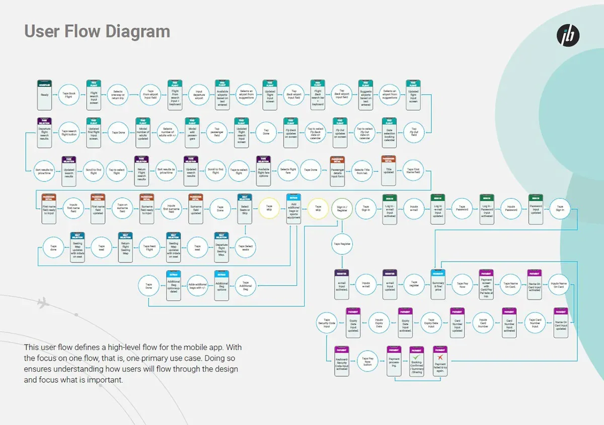
A linear flow, drawn first, then sketched on paper until it felt right.
Booking is a linear process, so the flow came before any sketch: one primary use case, the happy path from search to a paid ticket, so everyone understands how a user moves through the design and what matters at each point.
Then paper. Sheet after sheet of phone frames: home and search, flights and dates, passengers, fares, seats, bags, details and payment. Sketching is cheap, so each screen got several attempts before one was worth taking further.
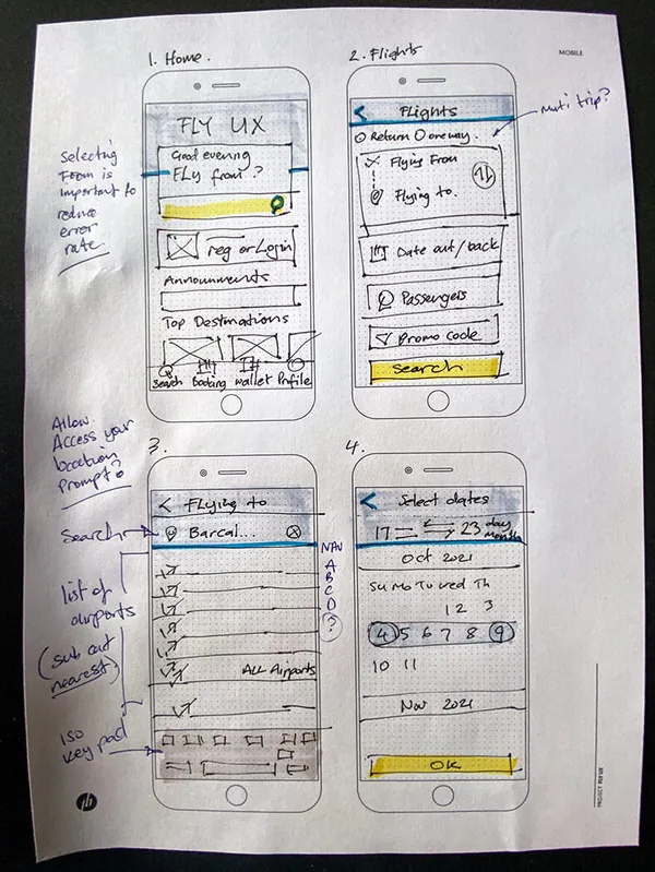
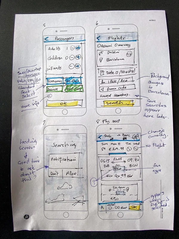
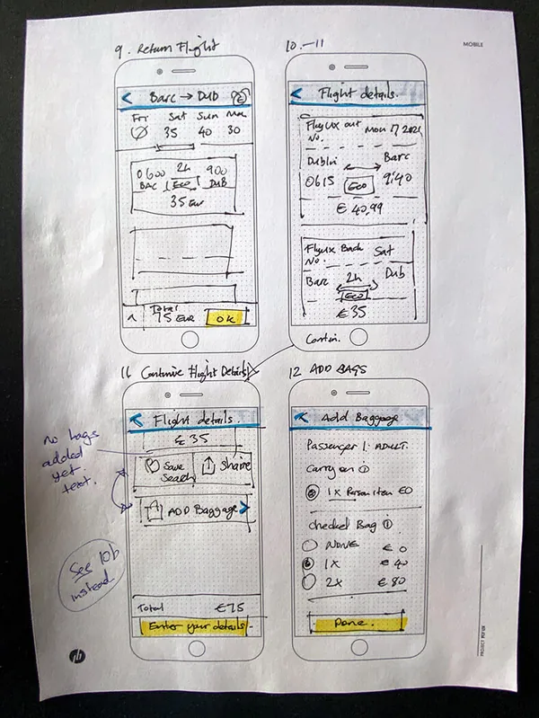
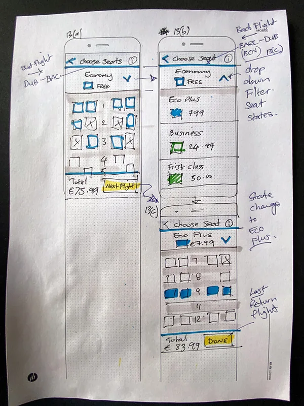
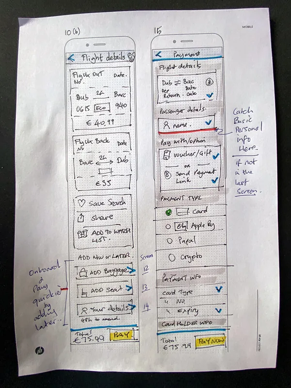
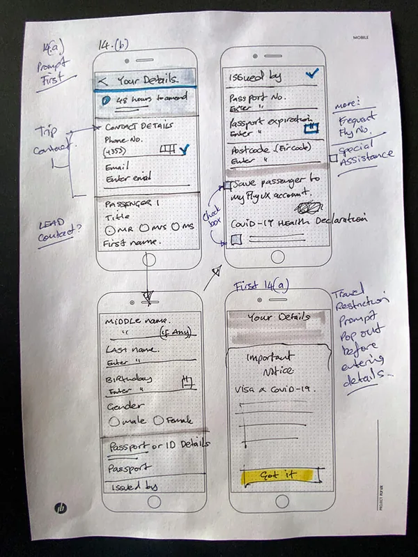
A medium-fidelity prototype of the whole happy path.
The sketches became an interactive Figma prototype covering the complete happy path, and an annotated version explains each screen's behaviour for anyone building it. Read the annotations PDF (6.3 MB).
Opens in a new tab. Medium fidelity: the flow is complete, the polish is not the point.
What the project taught: strong research makes design decisions easier to make and easier to defend. UX is iterative, and further testing would show where the next improvements are.
Where I would take it now. This project runs the double diamond in full, and that rigour is what makes its findings defensible. On a live product I would reach a working prototype sooner and let real behaviour confirm or correct the research, with AI taking the last mile of design and code.