 Jon BondProduct & accessibility designer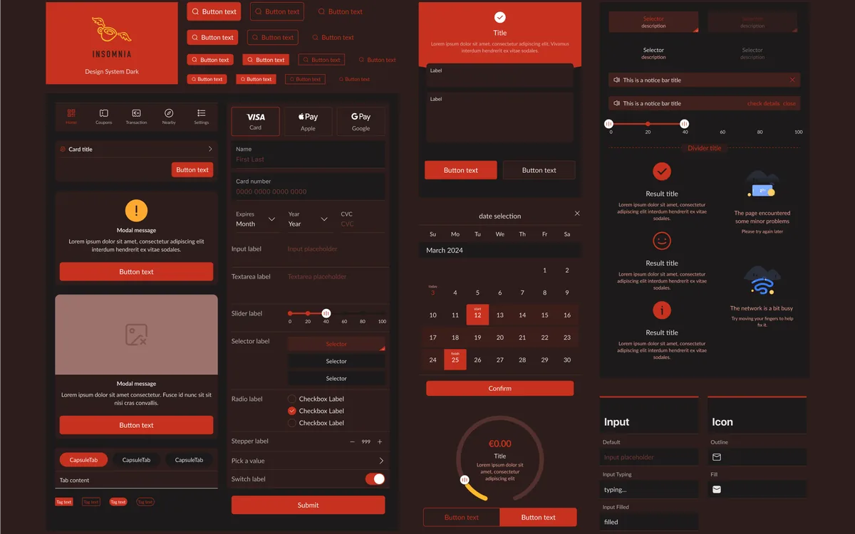
A loyal customer base, and an app that had stopped keeping up.
Insomnia Treats is the loyalty app for Insomnia Coffee Company: earn rewards and treats, then order and pay from your phone. By 2020 the interface looked dated, the navigation took work to get through, and the two things people opened the app for, pay and treats, sat several taps away. Nothing about it felt like yours.
The brief: lead the design of a new UI on top of the existing service, which meant
- modernise the look without breaking what regular customers already knew
- put pay and treats one tap from the home screen
- give people a way to make the app their own
- hand over every asset and redline so the iOS and Android builds matched
The old app hid the two things people came for.
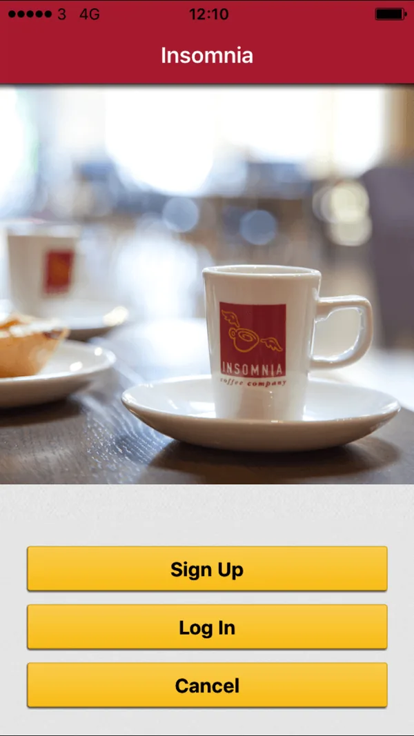
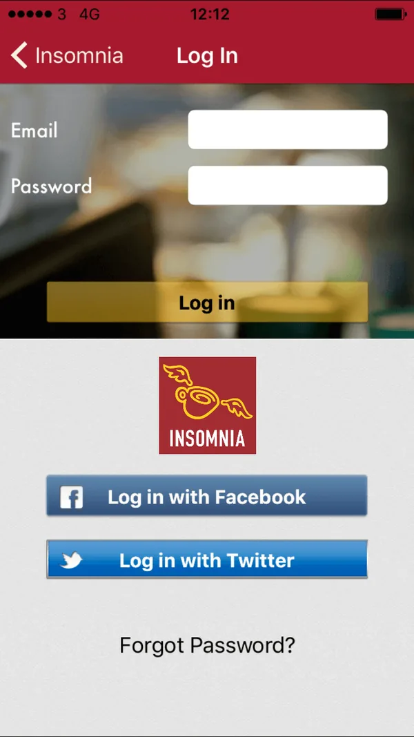
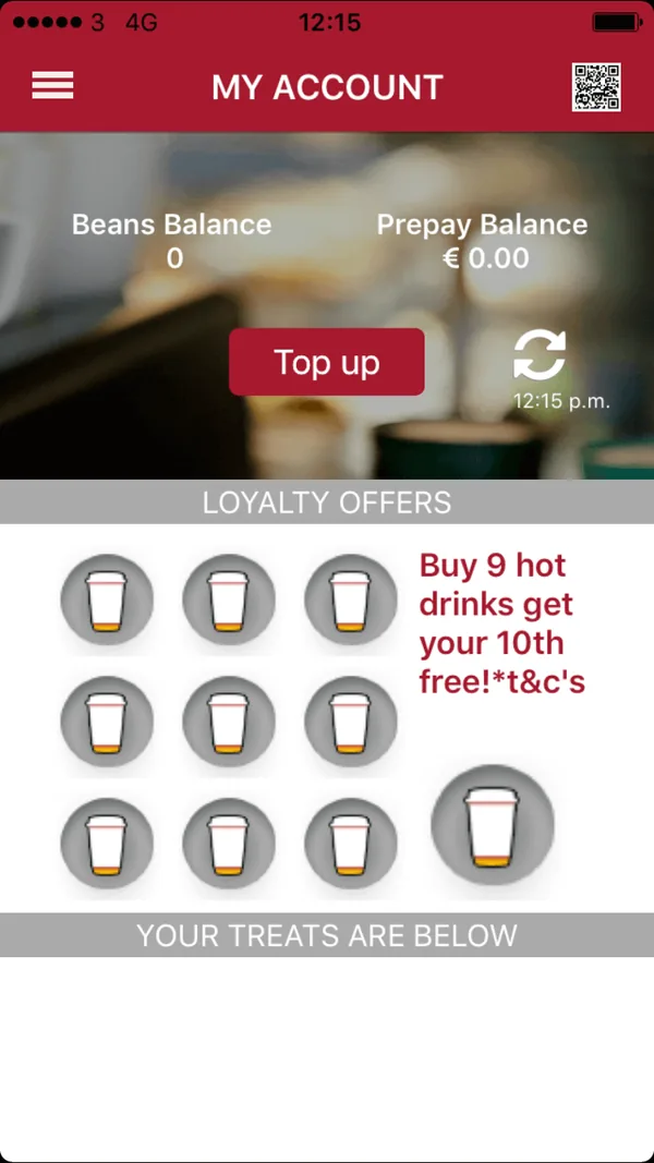
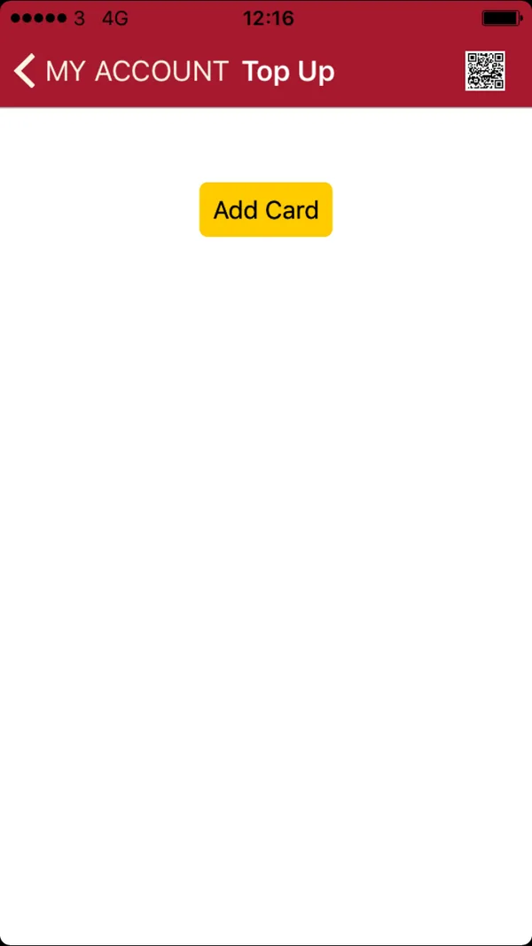
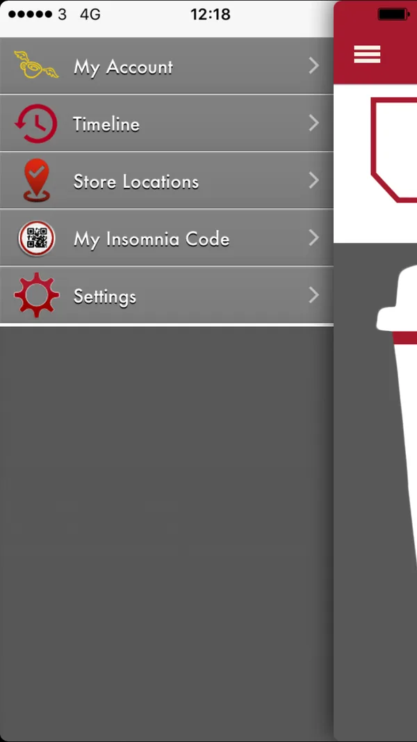
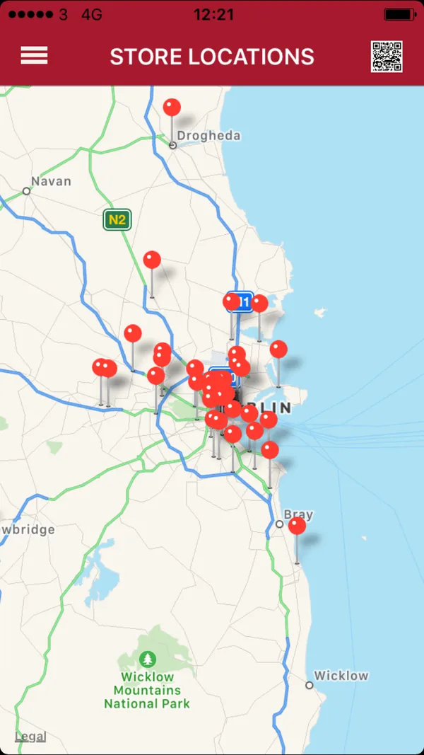
Six screens from the app as it stood. The start screen leans on a photograph, sign-in is a stack of full-width buttons, and the account screen crowds balances and a top-up into a red header. Coupons, transactions and the store map live behind a hamburger menu, so paying and collecting a treat both begin with a hunt.
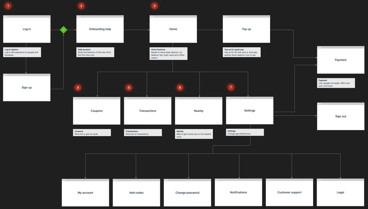
One ideal path through the app, drawn before any screen.
The app flow maps the route a customer takes the first time they open the new UI: log in or sign up, a one-off onboarding tour of what changed, then home. Home shows the bean balance, prepay balance, treat cards and coffee tokens, and fans out to coupons, transactions, nearby stores and settings. Top up sits one step off home, with payment by card, Google Pay or Apple Pay and a scan option for card entry.
Drawing the flow first meant the right information arrived at the right moment and every task finished in as few steps as the service allowed. The onboarding screens show once, then get out of the way.
Light and dark, from one set of variables.
The new interface is built as a design system in Figma, with colour variables that switch the whole thing between a light and a dark theme. Both share the same components: primary, outline and ghost buttons at four sizes, cards, modals, form fields, a stepper, a date picker with a selected range, a payment ring, notice bars and empty states for network and page errors. Insomnia's red and gold carry across both, so the app stays recognisably theirs in either mode.
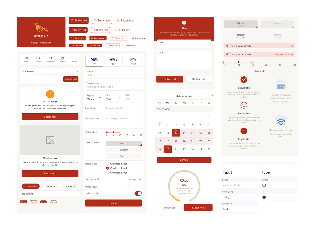
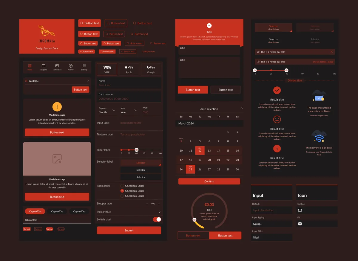
Opens in a new tab. Switch to dark mode from the prototype's settings screen.
Handed over as assets and redlines, built for iOS and Android.
The deliverable was the full set of screens, the light and dark systems, and the assets and redlines for both platforms, handed to Luis Zuravski, the software engineer who built the app.
Some context on the programme the UI serves, reported by Insomnia Coffee Company rather than measured by me: Insomnia is Ireland's largest coffee chain, with more than 120 branches and a growing network in the UK, and its loyalty and payment programme passed one million loyalty transactions in a single year. Both figures are Insomnia's own, quoted in Escher Group's published case study on the loyalty programme, and they predate this redesign. They say something about the scale the new UI had to serve, not about its results.