Selected work

Moola

Fintech / Certification · 2024

Role
Sole UI designer on a UX Design Institute university credit-rated UI design certification brief. Coursework, not client work.
Deliverables
Brand identity and style sheet; high-fidelity My Accounts, Current Account and My Spending screens at mobile, tablet and desktop, prepared for handover.
Stack
Figma.
Status
Coursework. Reviewed and graded by the UX Design Institute; not a client product.
Available for freelance / join a teamhey@jon-bond.com
Three Moola mobile screens on white phones over lilac: Accounts with a €13,600 total balance, a Current Account transaction list, and a My Spending chart

Three wireframes, one instruction: make a bank feel playful without losing trust.

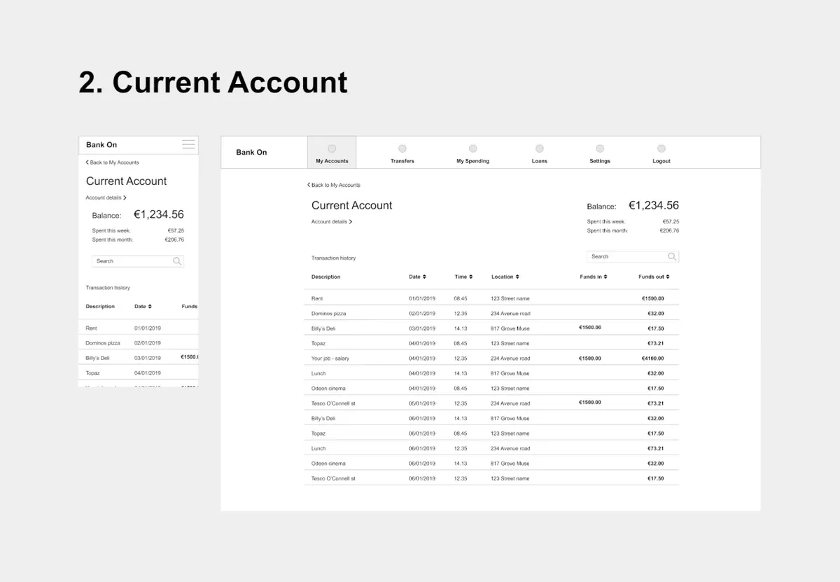
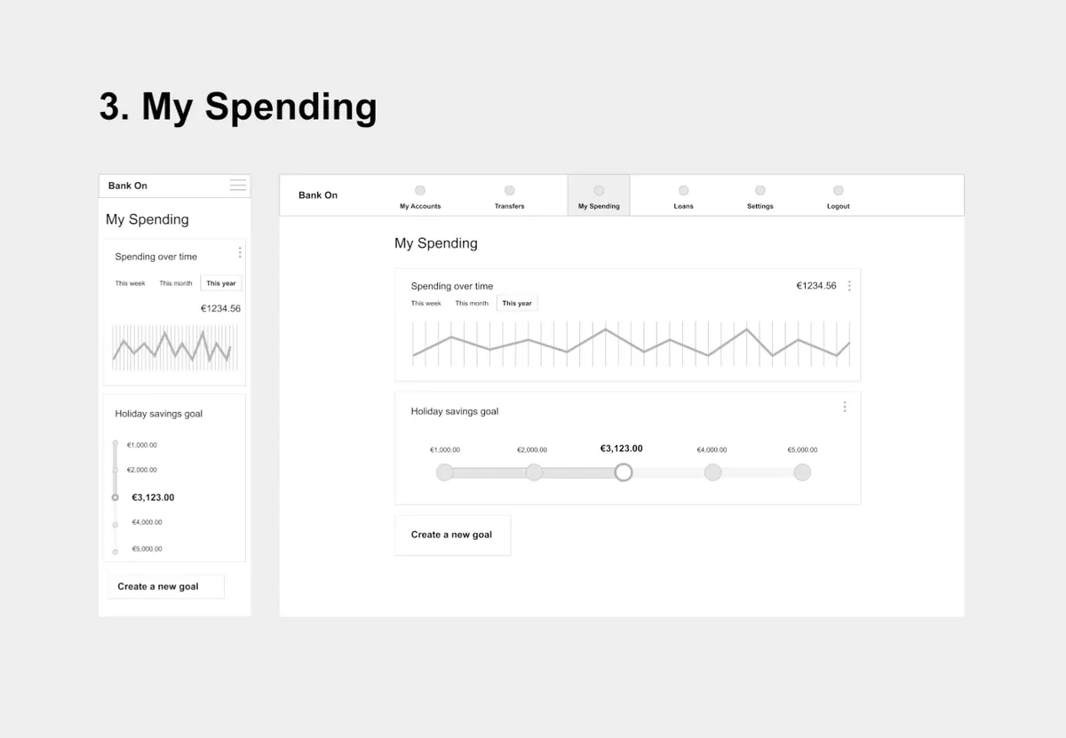
The brief came with the UX already done: wireframes for a My Accounts screen, a Current Account screen and a My Spending screen, each at mobile and desktop. My job was everything visual. Define a brand for a new bank called Moola, then design the three screens in high fidelity and make them work at mobile, tablet and desktop.

  • brand identity: define a personality for Moola and apply it everywhere
  • UI design: three polished, high-fidelity screens
  • responsive design: one experience across three sizes
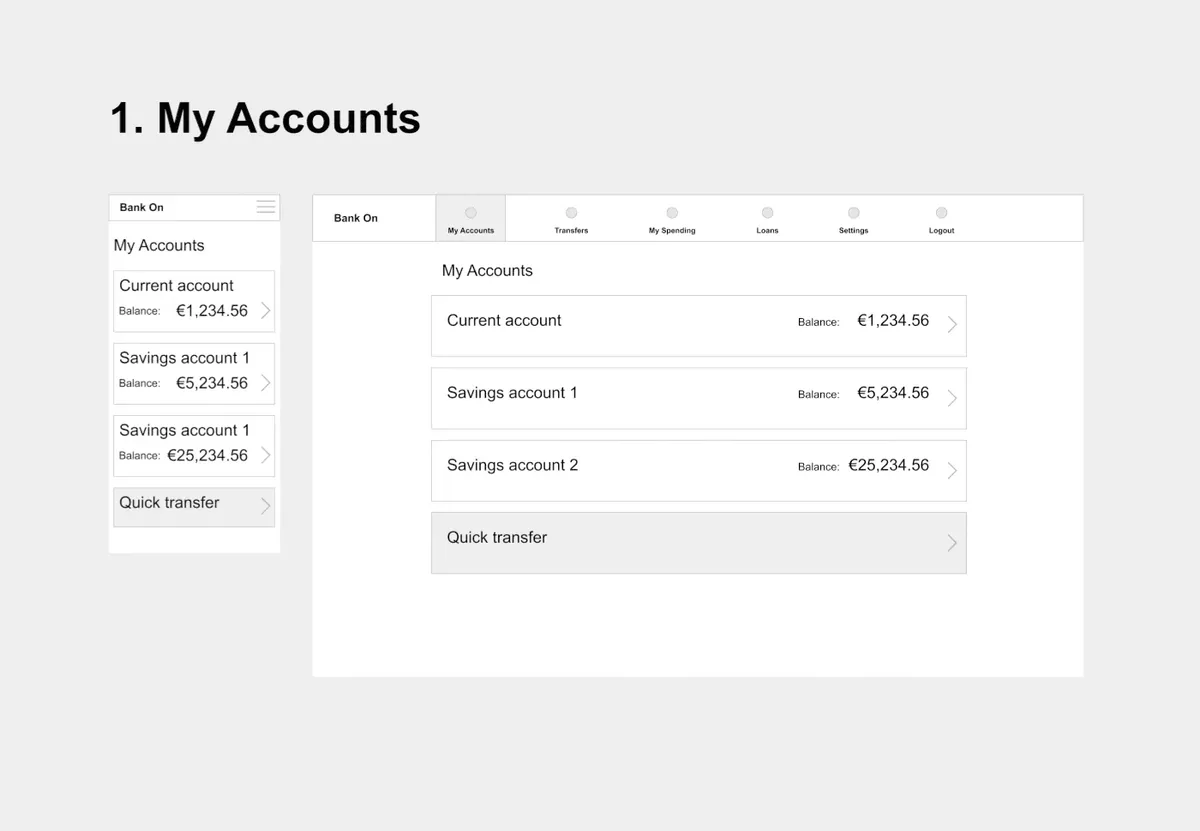
Supplied wireframe for My Accounts: a mobile and a desktop layout listing current and savings accounts with balances and a quick transfer
Wireframe · My Accounts
Supplied wireframe for Current Account: a mobile and a desktop layout with a balance, spend this week and month, and a transaction history table
Wireframe · Current Account
Supplied wireframe for My Spending: a mobile and a desktop layout with a spending-over-time chart and a holiday savings goal slider
Wireframe · My Spending

Playful, clear, trustworthy. Every later decision answered to those three words.

Before any pixels, I wrote down what Moola should feel like.

  • Playful. Using the product should be a joy. Colour, animation and shape carry personality, never at the cost of being intuitive.
  • Clear. It is people's money. Information is presented uncluttered, and white space does a lot of the work.
  • Trustworthy. The presentation has to convey that the money is safe.

Each word got its own moodboard, so the tone existed as pictures as well as a sentence.
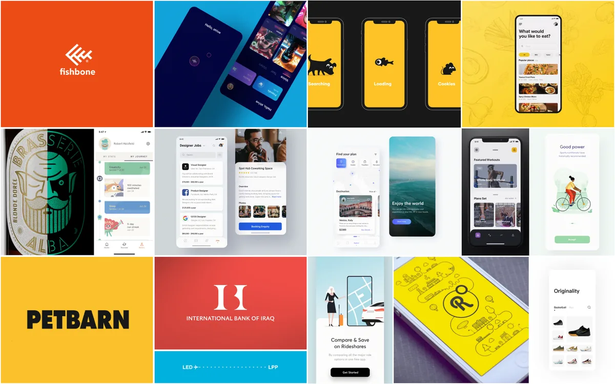
Playful references moodboard: bright orange, yellow and teal app screens, bold wordmarks and illustrated onboarding
Moodboard · Playful
Clear references moodboard: sparse banking and payment screens with generous white space and a single accent colour
Moodboard · Clear
Trustworthy references moodboard: established bank brands, blue account screens, a bank branch and secure card imagery
Moodboard · Trustworthy

Moodboards for colour, type, shape and icons, before committing to any of them.

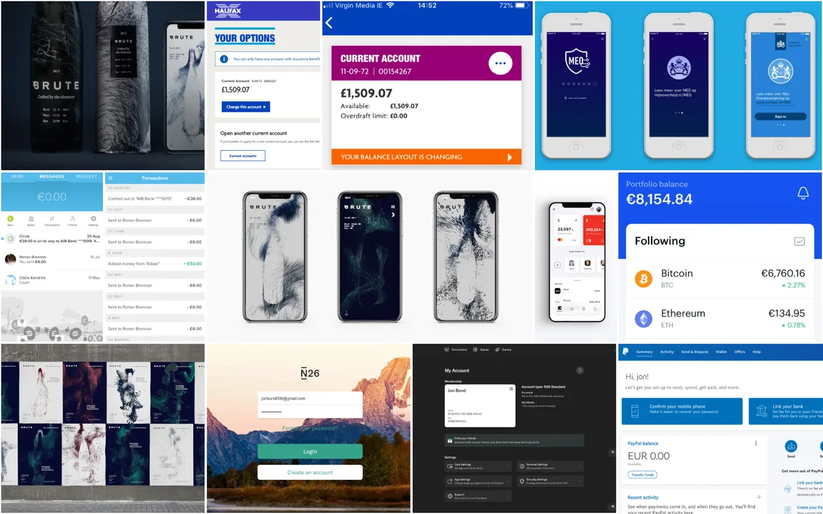
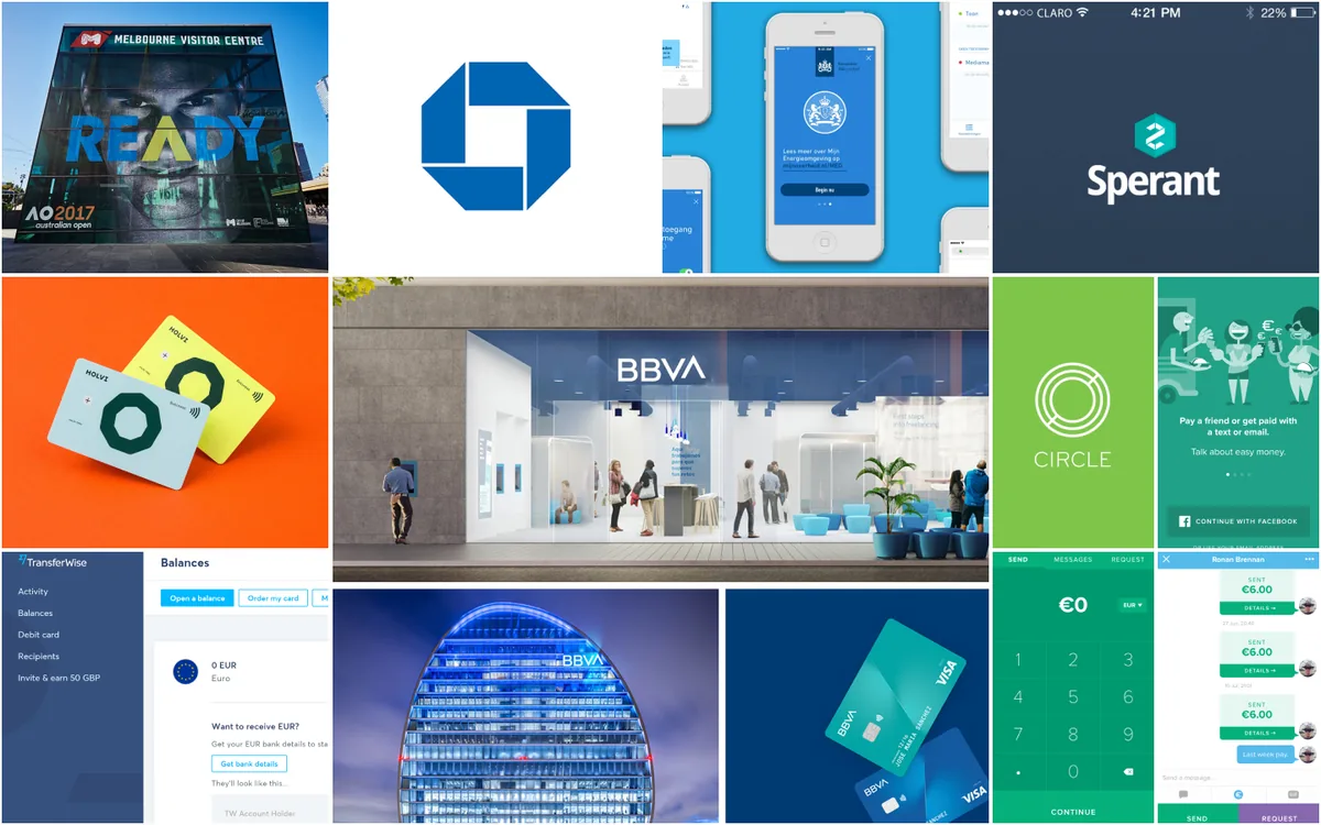
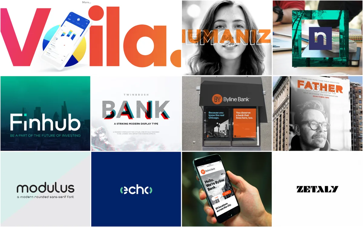
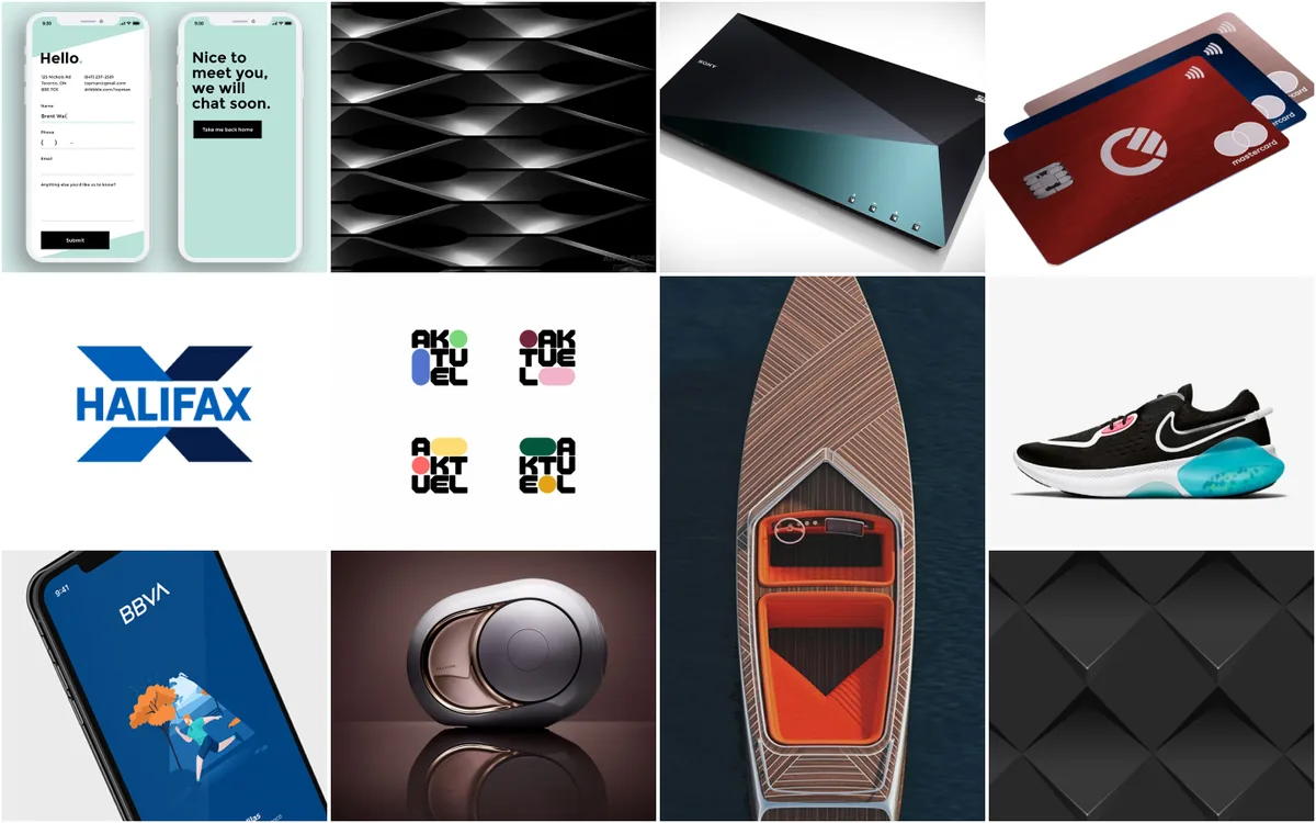
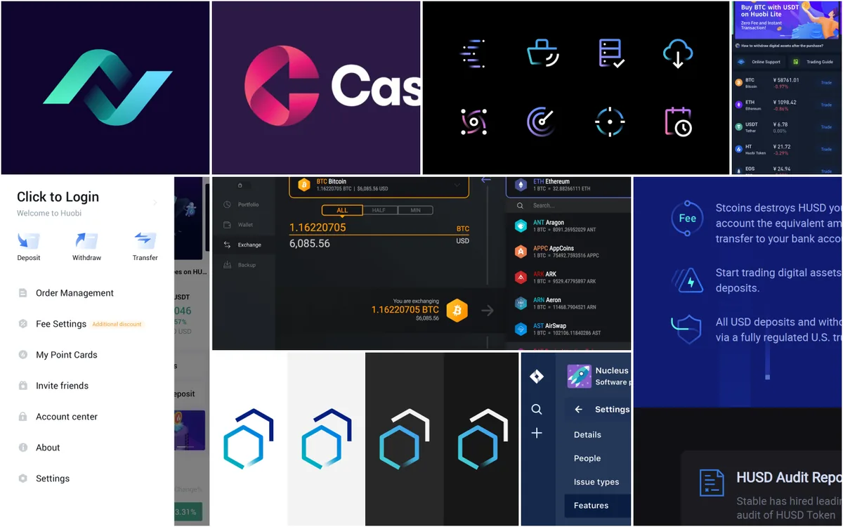
With the tone set, I collected references for each part of the visual system: interfaces, colour palettes, typography pairings, shapes and iconography. The point was range. Seeing bright, rounded, gradient-heavy work next to restrained banking UI made it easier to pick a position between the two than to drift to one end.
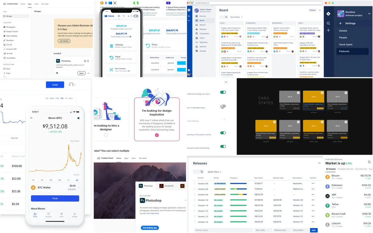
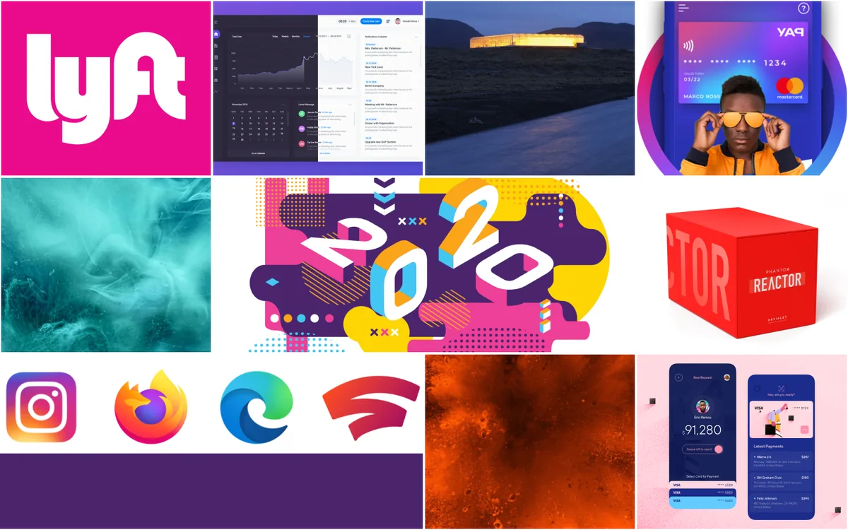
UI references moodboard: dashboards, crypto wallets, card state variations and release tables in light and dark themes
Moodboard · UI
Colour references moodboard: magenta, purple and teal gradients, the Lyft pink, and vivid poster and packaging colour
Moodboard · Colour
Typography references moodboard: display wordmarks, a rounded sans-serif specimen and editorial bank advertising
Moodboard · Typography
Shape references moodboard: soft rounded cards and devices, faceted surfaces and a boat hull
Moodboard · Shape
Iconography references moodboard: gradient line icons, hexagonal logo marks and a crypto exchange icon set
Moodboard · Iconography

A style sheet that turns the tone into tokens.

The style sheet fixes the choices: a purple-to-pink brand gradient with turquoise, green and blue as accents; Figtree at every heading and body size; soft, rounded buttons in filled, outline and ghost variants; alerts; a small set of brand icons; and semantic tokens for foreground, border and state colours, so the palette stays consistent and checkable.

Two decisions did most of the work. Colours were built in HSL, which made a systematic, contrast-checked palette straightforward. And mobile navigation uses a standard tab bar rather than a hamburger menu, so the main features are always in view.
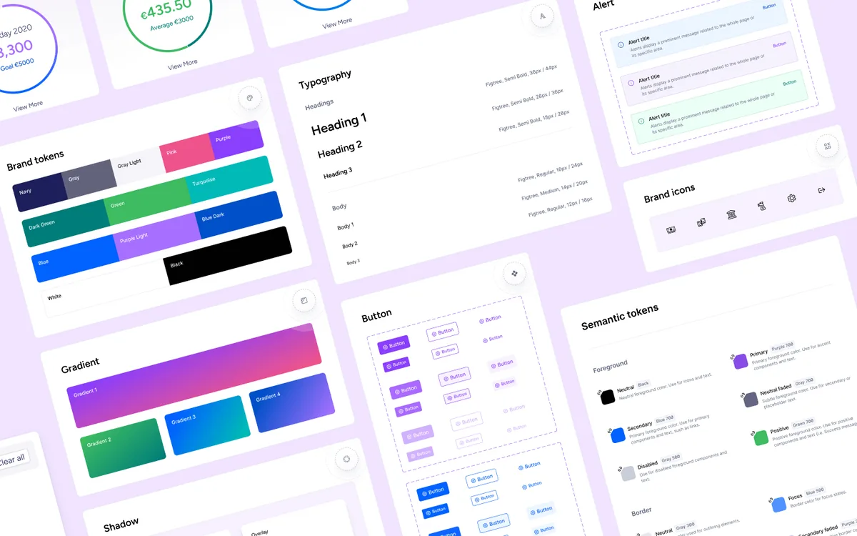
Moola style sheet on lilac: brand tokens from navy to purple and turquoise, four gradients, a Figtree type scale, filled and outline buttons, alert banners, brand icons and semantic foreground and border tokens
Style sheet · Tokens, type, buttons, alerts, icons

The same account summary at phone, tablet and desktop.

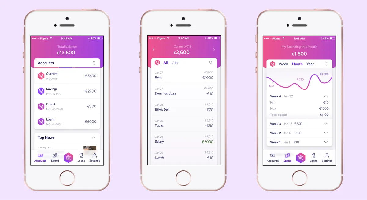
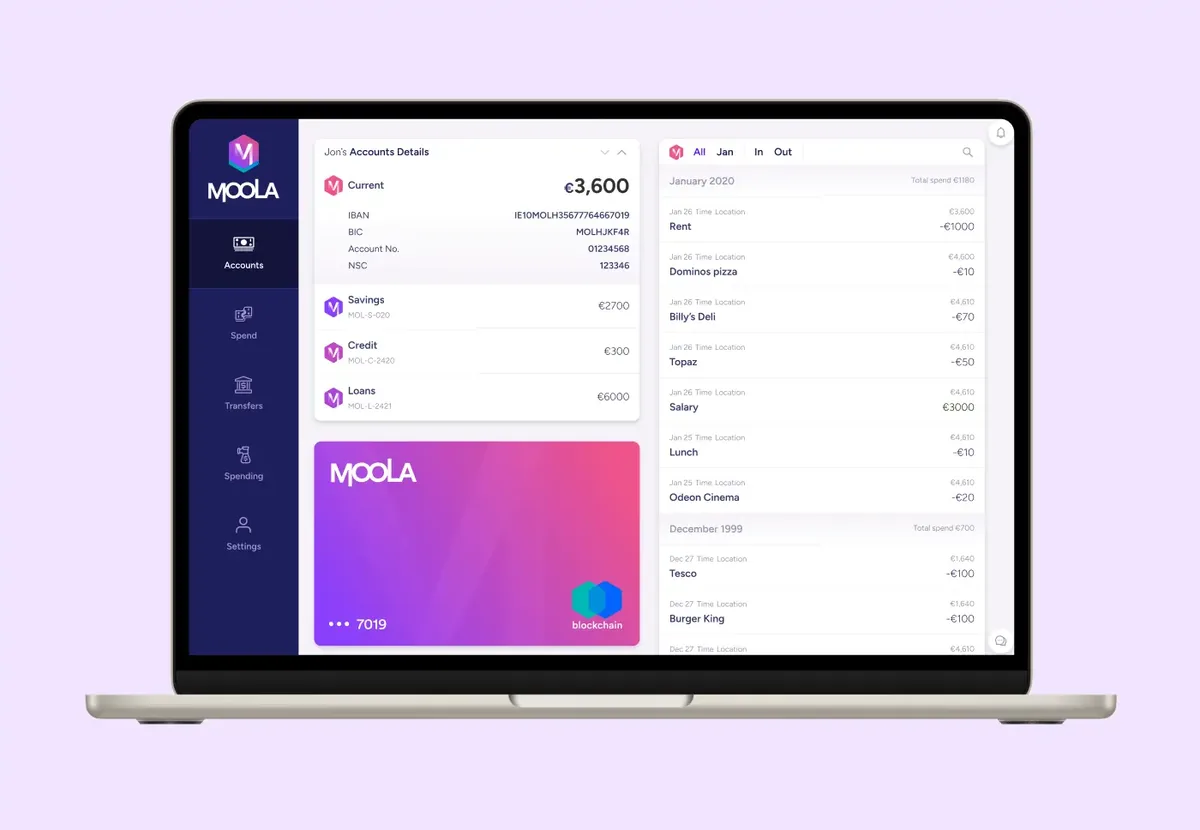
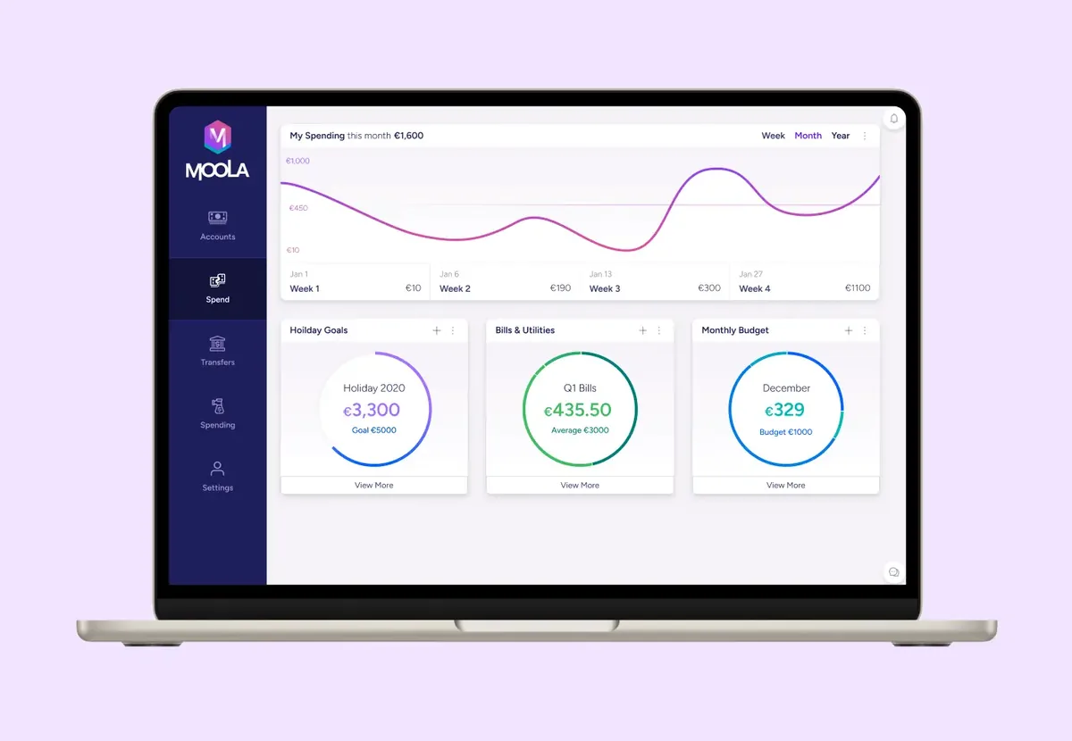
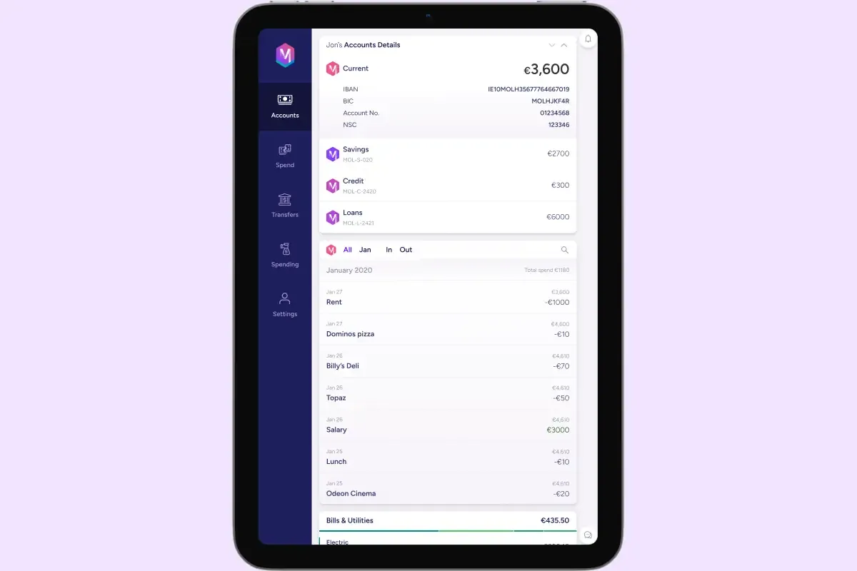
The final designs for My Accounts, Current Account and My Spending at all three sizes. The desktop uses a persistent left rail and two columns, the tablet keeps the rail and stacks the cards, and the phone moves navigation to a tab bar and leads with the balance.
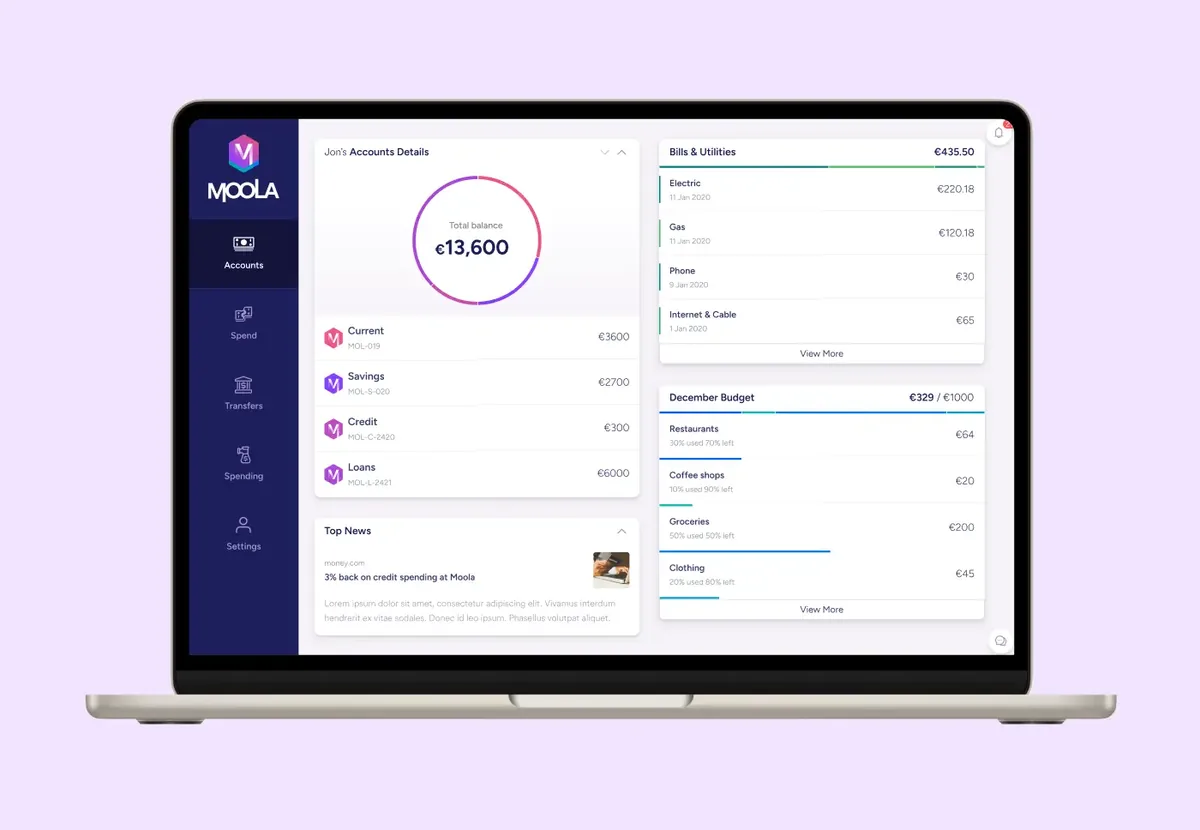
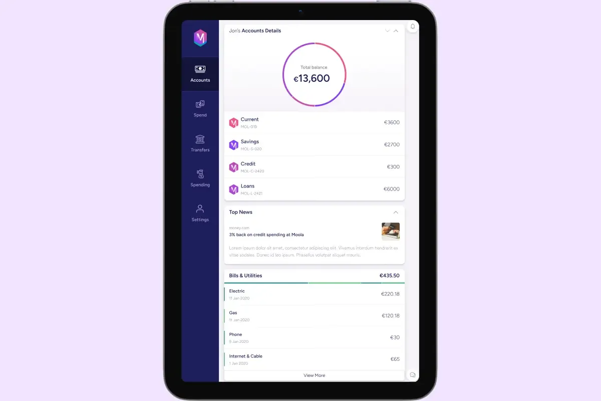
Moola My Accounts at desktop on a laptop: a navy left rail, a €13,600 total balance ring, current, savings, credit and loans accounts, bills and utilities, and a December budget
Desktop · My Accounts
Moola My Accounts at tablet size: the same rail and balance ring with the account list, top news and bills stacked in one column
Tablet · My Accounts
Moola at mobile size on three phones: Accounts with a €13,600 total balance and a tab bar, Current Account with a January transaction list, and My Spending with a weekly chart
Mobile · Accounts, Current Account, My Spending
Moola Current Account at desktop: a €3,600 balance with IBAN details, a filterable January transaction list and a gradient Moola card
Desktop · Current Account
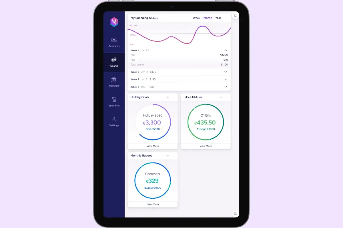
Moola My Spending at desktop: a monthly spending curve by week and rings for a holiday goal, Q1 bills and the monthly budget
Desktop · My Spending
Moola Current Account at tablet size: balance and account details above the transaction list
Tablet · Current Account
Moola My Spending at tablet size: the spending curve with weekly breakdown and goal rings in two columns
Tablet · My Spending

What the brief taught: a methodical process, from tone to tokens to pixels, beats reacting quickly. Contrast checking and legible type are not optional, and HSL made an accessible palette easier to reason about. The interesting part was the balance between a distinctive identity and the conventional patterns that make a bank feel safe.

Next: FlyUX