 Jon BondProduct & accessibility designer
IRP Commerce Solutions
Ecommerce / AI · 2026, ongoing
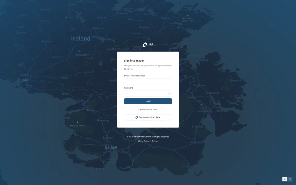
Ecommerce is ultimately about making money. The admin should look like it.
IRP asked for a UX/UI redesign that would turn their ecommerce platform into a modern financial management system: “financialise” the interface, starting with the IRP Trader module, so it reads as a professional market trading terminal rather than a standard admin like Shopify or Magento. The working phrase was “Day Trading for Merchant Profit”: serious, accurate, and focused on real-time market data, risks and opportunities.
The interface also had to be designed for AI orchestration. Real-time buyer predictions, Live Risk Pulses and automated intervention strategies needed to be legible and trustworthy at a glance, so that merchant owners, ecommerce managers and investors could act as AI orchestrators instead of form-fillers.
The immediate scope was design concepts for a prototype:
- IRP Shopper Admin: the login screen and the standard admin grids and forms
- IRP Trader: a Mission Control dashboard and a Sales Analysis page, data-heavy and focused on analytics
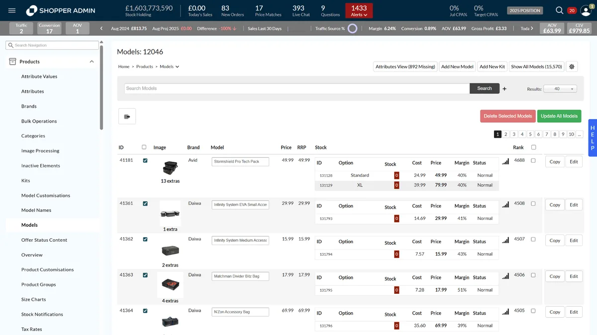
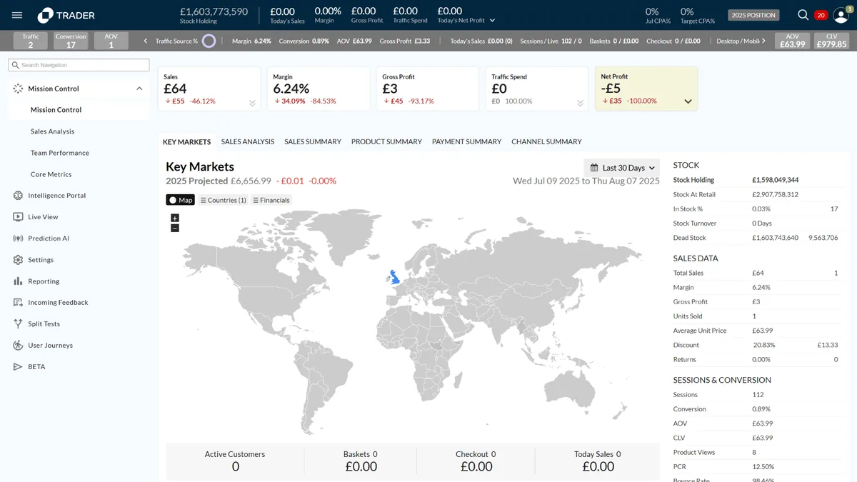
Before: a conventional admin grid, with no sense of money moving.
The existing Shopper Admin and Trader pages did the job of a typical ecommerce back office: navigation trees, product tables, a world map and a column of totals. Everything was there, all at the same weight.
Production pages in, logic-aware prototypes out.
The core design problem: take complex, real-time predictive data and make it something an operator can actually act on. That meant deciding what to surface, what to suppress, and how to make a prediction explainable. A judgment problem before a UI one.
To keep the judgment close to the real product, I set up an AI prototyping workflow that starts from production pages rather than blank artboards.
- Import
Existing production pages are pulled straight into Figma with the html.to.design plugin. Figma is the hub for pre-processing and iteration.
- Iterate
Cursor is the primary AI code editor, iterating on the pages with DevTools and Figma side by side.
- Branch
One GitHub repo is the single source of truth. The engineer works between the main repo and production; each designer pushes to their own branch.
- Publish
GitHub Pages previews the branches live, and the engineer publishes the final iterations back to the production pages.
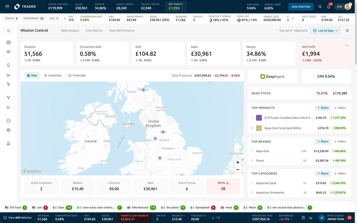
Mission Control: triage the day in one glance, then drill into detail.
The final direction keeps the terminal density but gives it an order. A ticker of stock holding, sales, margin, profit and spend runs along the top. Six headline metrics sit under it, with net profit tinted when it drops. Then the map, the projection, dead stock and the risers and fallers, in the order a merchant would ask about them.
Sales Analysis is data-dense by necessity, structured so power users aren’t overwhelmed. Core Metrics grades every figure as good or bad before you read it. Team Performance shows who has been in the platform and where.
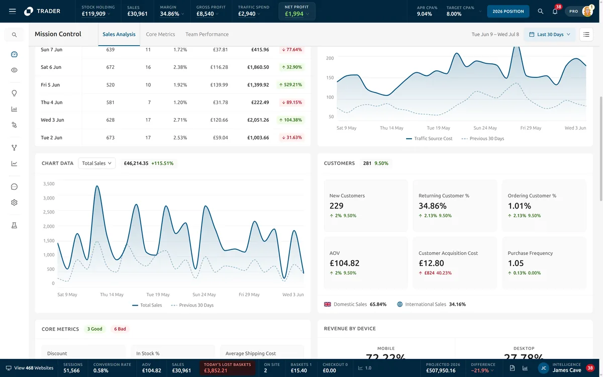
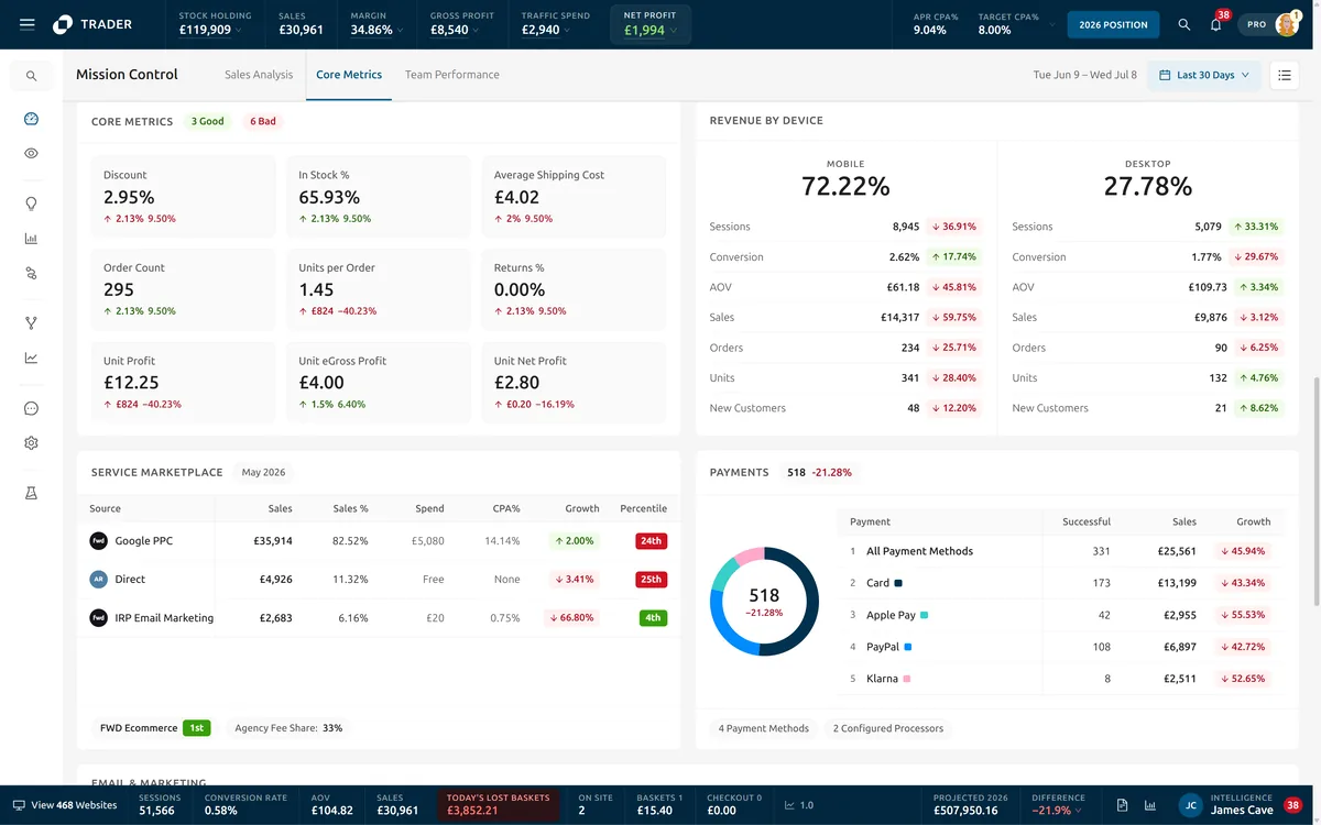
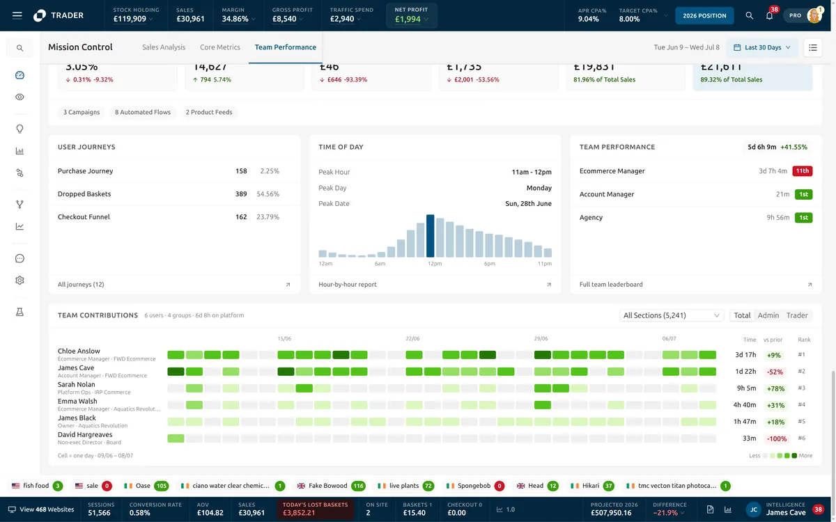
Opens in a new tab. Click Service Marketplace on the login screen to enter the dashboard.
The same problem on a fraction of the screen.
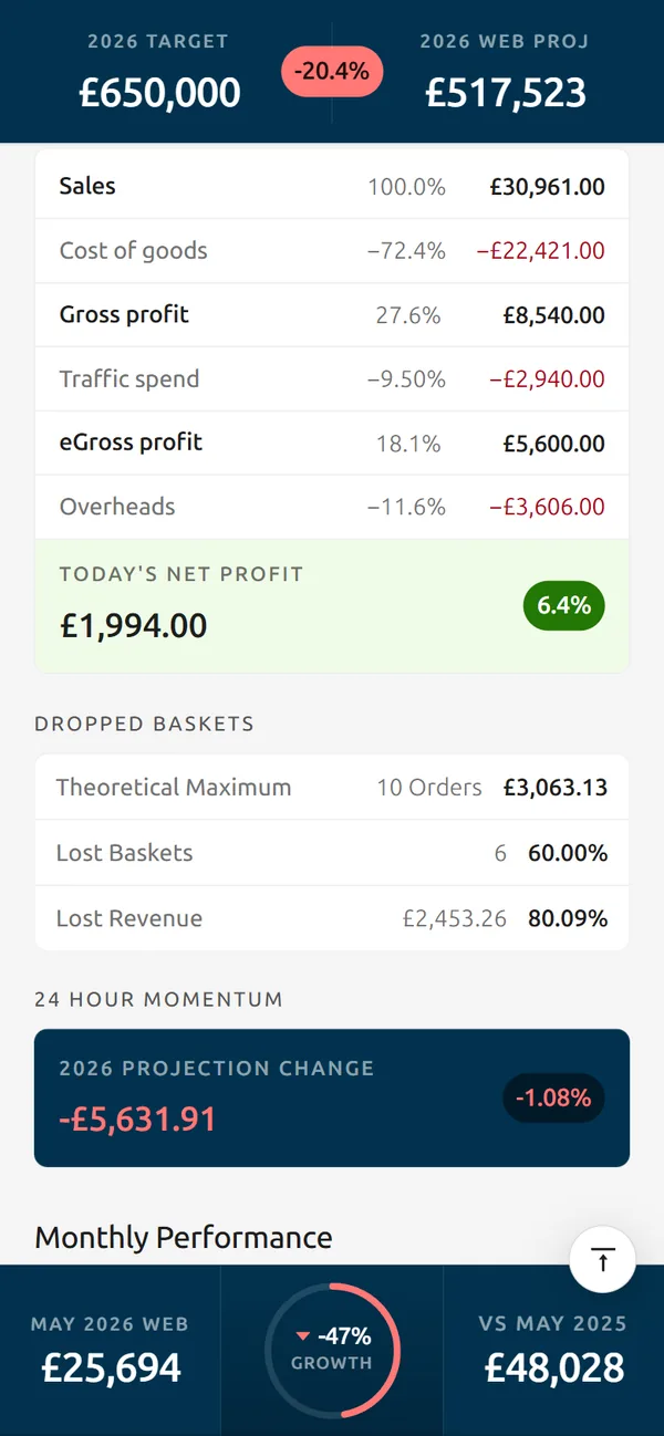
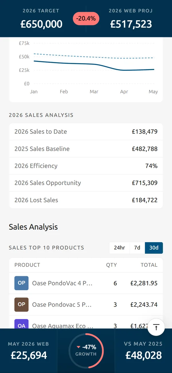
This isn’t a finished engagement. I’m currently designing a mobile insights product for the same client, carrying the same problem onto a smaller surface: how to make real-time predictive data legible and trustworthy when you’ve got a fraction of the screen to work with.
On a phone the day opens with a sentence before a number, the target and the projection share one card, and today’s pace is a single bar against a typical Friday. The net profit walks down from sales to overheads one line at a time.
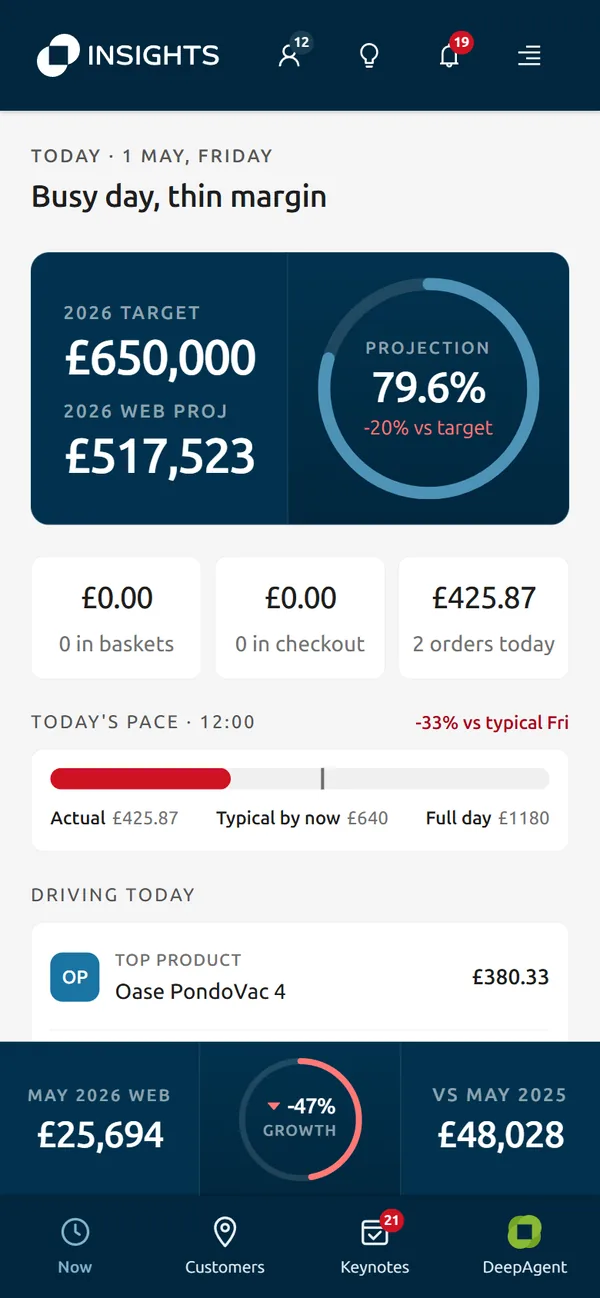
Opens in a new tab. Work in progress; best viewed on a phone.